
As face in article Clustering: a real project to explore data, we used unsupervised machine learning to segment/cluster 192 North Carolina neighborhoods based on several key housing market indicators.
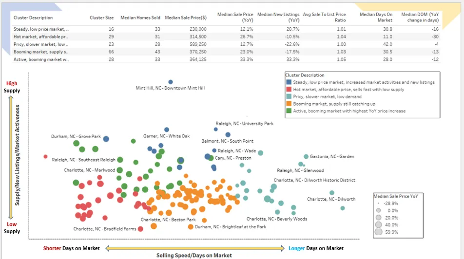
At the end of the project, we exported the data and suggested using tools such as Tableau and Google Looker to visualize the results obtained through some graphs. One of the possible visualizations is the Scatter Bubble graph, an excellent technique for visualizing segmentation results. It allows, in fact, to project clusters on 3 dimensions: the x and y axes for the first two dimensions and the bubble size for the third. Below is a possible screenshot of the Tableau dashboard.
Although Tableau is a fantastic tool for creating interactive visualizations, it is a bit of a hassle to switch between platforms: training models and creating segments in the Python environment and then viewing the results in another tool. Moreover, for professional use it is chargeable. For these reasons, in this tutorial I would like to show you how to use Python’s Plotly Go (Graph Objects) to create the same interactive graph with custom colors and tooltips that can meet your needs in this use case.
Plotly Express vs Plotly Go
The Plotly Python library is an interactive, open-source plotting library that covers a wide range of graph types and data visualization use cases. It has a wrapper called Plotly Express that is a higher-level interface to Plotly.
Plotly Express is quick and easy to use as a starting point for creating the most common figures with simple syntax, but it lacks functionality and flexibility when it comes to more advanced chart types or customizations.
Unlike Plotly Express, Plotly Go (Graph Objects) is a lower-level graph package that generally requires more code, but is much more customizable and flexible. In this tutorial, we will use Plotly Go to create an interactive scatter bubble graph similar to the one created in Tableau. You can also save the coding as a template to create similar charts in other use cases.
Read and prepare data
At the end of the previous project, we created a data frame containing housing market metrics for 192 NC neighborhoods and the clusters assigned (cluster_nbr) by the k-means algorithm. We read this data and take a look at the appearance of the data:
					#Import libraries
import pandas as pd
import numpy as np
import plotly.graph_objects as go

#Read the cluster data
df_NC=pd.read_csv('.../df_NC.csv',index_col=[0])
Fields=[
'region',
'period_begin',
'period_end',
'period_duration',
'parent_metro_region',
'property_type',
'median_sale_price',
'median_sale_price_yoy',
'homes_sold',
'new_listings_yoy',
'median_dom',
'median_dom_yoy',
'avg_sale_to_list',
'cluster_nbr',
'0',
'1',
'2'
]
#Only select fields that are needed in this visualization
df_NC=df_NC[Fields]

df_NC.info()

We have 192 rows and 17 fields. The “cluster_nbr” field is the cluster label we have assigned to each neighborhood based on the k-means algorithm. The last three fields are principal components derived from PCA, which will allow us to project our clusters onto a scatter plot, with the first two principal components as x and y axes.
We also rename some columns to make them more understandable. Also, the cluster_nbr column is an integer, which will not work later in our code to produce the desired output. Therefore, we will have to change its data type to string.
					#Rename fields to make them easier to understand
df = df_NC.rename({'region': 'Neighborhood', '0': 'PC1','1':'PC2','2':'PC3'}, axis=1)
df['cluster_nbr'] = df['cluster_nbr'].apply(str) #Change data type for cluster_nbr
df.head()


Add cluster description
Now that we have read and prepared the cluster data, let’s do a quick analysis to show the summary statistics at the cluster level. This will help us understand the distinct characteristics of each cluster and add a meaningful description for each cluster (instead of generic labels for clusters such as 0,1,2,3, etc.).
					#Create summary statistics for clusters. Calucating medians for the following metrics at cluster level
df1=df.groupby(['cluster_nbr'])['cluster_nbr'].count()
df2=df.groupby(['cluster_nbr'])['homes_sold','median_sale_price','median_sale_price_yoy','new_listings_yoy','avg_sale_to_list','median_dom','median_dom_yoy'].median()
df_summary=pd.concat([df1, df2],axis=1)
df_summary.rename({'cluster_nbr': '# of Neighborhoods','homes_sold':'Median Homes Sold','median_sale_price':'Median Sale Price','median_sale_price_yoy':'Median Sale Price YoY','new_listings_yoy':'Median New Listings YoY','avg_sale_to_list':'Median Sale-to-List Ratio','median_dom':'Median Days on Market','median_dom_yoy':'Median Days on Market YoY (days)'}, axis=1)

Based on the summary statistics, we can describe the characteristics of each cluster. For example, cluster “1” has the shortest median days on the market and the second-highest price increase from the previous year, while cluster “2” is a relatively expensive market with the highest median selling price but the largest price decrease from the previous year. In addition, houses in this cluster take longer to be sold. Based on our observations, we can add a cluster description column to our data set:
					#Add cluster description to the dataframe
def f(row):
    if row['cluster_nbr'] == '0':
        val = 'Steady, low price market with increased supply/new listings YoY'
    elif row['cluster_nbr'] == '1':
        val = 'Rising/hot market.Affordable price.Sells fast with decreased supply/new listings YoY'
    elif row['cluster_nbr'] == '2':
        val = '#Pricy,cool market. Sells slower than other segments.Relatively lower demand'
    elif row['cluster_nbr'] == '3':
        val = 'Booming market.Supply still catching up'
    elif row['cluster_nbr'] == '4':
        val = 'Active/booming market with highest YoY sales price increase'
    else:
        val = 'NA'
    return val

df['cluster_desc']= df.apply(f, axis=1)
df.head()

Creating a scatter plot with Plotly
To familiarize ourselves with Plotly, let us first create a simple standard scatter plot with a couple of lines of code, as shown below.
					#Create a standard scatter plot
fig = go.Figure()
fig.add_trace(go.Scatter(x = df["PC1"], y = df["PC2"],
                        mode = "markers"))
fig.show()
The basic scatter plot projects the 162 neighborhoods on a two-dimensional graph. The X-axis is the first principal component (PC1) representing the sales velocity/days on market metric. The Y-axis is the second principal component (PC2) representing the supply/new listings metric on an annual basis.

When you hover over each data point, the graph shows a tooltip with x and y coordinates, by default. With a couple of lines of code, we have created a basic interactive graph that is quite convenient. Now we can add more features and customizations to the graph and make it more informative. Specifically, we will customize and refine the graph by doing the following things:
- Show the data points with custom colors representing different clusters.
- Add the bubble size representing the “median sales price increase (y/y)” for each data point.
- Customize the tooltip on mouseover to show additional information about each data point.
- Add graph title, x- and y-axis labels, etc.
Adding customizations to the chart
To add customizations such as cluster colors, bubble sizes, and mouseover hints, three new columns need to be added to the data frame that assign these “customization parameters” to each data point.
The following code adds a new column called ‘color’ to the data frame. First we define a function called ‘color’ that assigns a unique color code (specified by us) to each cluster_nbr. Then we apply this function to each data point in the data frame, so that each data point has its own color code depending on which cluster it belongs to.
					#Define a function to assign a unique color code to each cluster.
#You can choose any color code you want by tweaking the val parameter
def color(row):
    if row['cluster_nbr'] == '0':
        val = '#0984BD'
    elif row['cluster_nbr'] == '1':
        val = '#E12906'
    elif row['cluster_nbr'] == '2':
        val = '#08E9E7'
    elif row['cluster_nbr'] == '3':
        val = '#E18A06'
    elif row['cluster_nbr'] == '4':
        val = '#0C861A'
    else:
        val = 'NA'
    return val
#Apply the function to each data point in the data frame
df['color']= df.apply(color, axis=1)
df.head()

We will also add a new column called “size” to each data point, which will show the size of each bubble. We want the bubble size to represent the median increase in the sales price on a year-over-year basis: the larger the bubble, the greater the increase in the sales price over the same period in the previous year.
Some data points have negative values for the median price change variable, and an error will result when trying to use this variable directly to plot bubble sizes. Therefore, we use the min-max scaler to scale this variable and drop it between 0 and 1 with all positive values.
					#Create the 'size' column for bubble size
from sklearn.preprocessing import MinMaxScaler
minmax_scaler=MinMaxScaler()
scaled_features=minmax_scaler.fit_transform(df[['median_sale_price_yoy']])
df['size']=pd.DataFrame(scaled_features)
df.head()

Finally, we add a ‘text’ column that will allow us to display custom tooltips when hovering over each data point. This can be achieved using a for loop shown in the following code.
					#Add 'text' column for hover-over tooltips
#You can customize what fields or information you want to show in tooltips in the code below
hover_text = []
for index, row in df.iterrows():
    hover_text.append(('Cluster Description:<br>{cluster_desc}<br><br>'+
                      'Neighborhood: {Neighborhood}<br>'+
                      'Metro: {parent_metro_region}<br>'+
                      'Homes Sold: {homes_sold}<br>'+
                      'Median Sales Price: ${median_sale_price}<br>'+
                      'Median Sales Price YoY: {median_sale_price_yoy}<br>'+
                      'New Listings YoY: {new_listings_yoy}<br>'+
                      'Median Days on Market: {median_dom}<br>'+
                      'Avg Sales-to-Listing Price: {avg_sale_to_list}'
                       ).format(
                       cluster_desc=row['cluster_desc'],
                       Neighborhood=row['Neighborhood'],
                       parent_metro_region=row['parent_metro_region'],
                       homes_sold=row['homes_sold'],
                       median_sale_price=row['median_sale_price'],
                       median_sale_price_yoy=row['median_sale_price_yoy'],
                       new_listings_yoy=row['new_listings_yoy'],
                       median_dom=row['median_dom'],
                       avg_sale_to_list=row['avg_sale_to_list']))
df['text'] = hover_text
df.head()

Embed all customizations
Now that the customization columns have been added to the data frame, we can create a figure and add the customizations to the figure.
In the code below, we first create a dictionary that contains the data frame for each cluster. Then we create a figure and add the first trace that uses the data from the first cluster. We scroll through the dictionary and add the other traces (clusters) one at a time to the figure, and finally we plot all the clusters in the same figure.
					# Dictionary with dataframes for each cluster
cluster_name=df["cluster_nbr"].unique()
cluster_data = {cluster: df.loc[df["cluster_nbr"] == cluster].copy()
                              for cluster in cluster_name}

#Create a figure
fig = go.Figure()

#Add color, hover-over tooltip text, and specify bubble size
for cluster_name, cluster in cluster_data.items():
    fig.add_trace(go.Scatter(
        x=cluster['PC1'], y=cluster['PC2'],
        marker = dict(color=cluster['color']),
        name=cluster_name, text=cluster['text'],
        marker_size=cluster['size']
        ))

# Tune marker appearance and layout
sizeref = 2.*max(df['size'])/(18**2)
fig.update_traces(mode='markers', marker=dict(sizemode='area',
                                              sizeref=sizeref, line_width=2))

fig.show()

Chart style and format
We achieved the goal of customizing the basic scatter plot with different colors per segment, custom text in the tooltips, and specific bubble sizes. We note that in the tooltip some metrics are shown with many decimals, which is difficult to read. Some metrics could be better shown in percentages. We therefore make these style changes to make the tooltips easier to understand.
					#Styling changes to reduce decimal places to 2
df['avg_sale_to_list'] = pd.Series([round(val, 2) for val in df['avg_sale_to_list']], index = df.index)
df['homes_sold'] = pd.Series([round(val, 0) for val in df['homes_sold']], index = df.index)
df['median_dom'] = pd.Series([round(val, 1) for val in df['median_dom']], index = df.index)

#Styling changes to change the data format to percentages
df['median_sale_price_yoy'] = pd.Series(["{0:.1f}%".format(val * 100) for val in df['median_sale_price_yoy']], index = df.index)
df['new_listings_yoy'] = pd.Series(["{0:.1f}%".format(val * 100) for val in df['new_listings_yoy']], index = df.index)
We will also add a title to the graph and axis labels. Recall that the x- and y-axes are two main components representing sales velocity and supply/new listings on an annual basis, so we label the axes according to these meanings.
					# Create figure

layout = go.Layout(
    title_text='NC Neighborhoods Housing Market Segments',
    title_x=0.5,
    xaxis = go.XAxis(
        title = 'Shorter Days on Market <-------------> Longer Days on Market',
        showticklabels=False),
    yaxis = go.YAxis(
        title = 'Lower Supply <------------> Higher Supply',
        showticklabels=False
    )
)

fig = go.Figure(layout=layout)


for cluster_name, cluster in cluster_data.items():
    fig.add_trace(go.Scatter(
        x=cluster['PC1'], y=cluster['PC2'],
        marker = dict(color=cluster['color']),
        name=cluster_name, text=cluster['text'],
        marker_size=cluster['size']
        ))

# Tune marker appearance and layout
sizeref = 2.*max(df['size'])/(18**2)
fig.update_traces(mode='markers', marker=dict(sizemode='area',sizeref=sizeref, line_width=2))

fig.update_layout(showlegend=False)
fig.show()

We have now created an interactive scatter bubble graph in Python with Plotly! As you can see, creating the graph takes a bit of work. This happens very often when working on a real use case since there are many details and nuances to think about and take care of in coding to make the graph look exactly like what you have in mind!


