
Whether you are an experienced data scientist or have just started your analytics journey, believe me, at some point in your career you will have come across or will come across at least one project involving segmentation/cluster analysis. This is probably one of the most widespread and important machine learning skills that you should learn and understand as a data scientist.
In this tutorial, we will guide you through a cluster analysis on some aspects of the North Carolina housing market as of mid-2021. We will identify clusters of these neighborhoods based on their similarities and differences on some key metrics, using unsupervised ML models. The raw data come from the Redfin Data Center and can be downloaded for free.
In this hands-on project, you will analyze housing market data collected from 162 North Carolina neighborhoods and identify clusters of these neighborhoods based on their similarities and differences on some key metrics, using unsupervised ML models. The raw data come from the Redfin Data Center and can be downloaded for free.
Introduction to cluster analysis
Before we launch into writing the code, let’s introduce some basic concepts about cluster analysis. Cluster analysis is a popular machine learning technique, widely used in many applications such as customer segmentation, image processing, and recommendation systems, to name a few.
In general, cluster analysis falls under the umbrella of unsupervised machine learning models. An unsupervised machine learning model, as the name suggests, is unsupervised, that is, no preassigned labels (e.g., cluster labels) are provided to the algorithm for the training data. Therefore, the generated model will find, through exploratory analysis, hidden patterns and extract insights from the data itself.

There are different types of clustering algorithms, such as those based on connectivity, centroids, density, distribution, and so on, each of which has advantages and disadvantages and is suitable for different purposes and use cases. Some of these we have already described in the articles DBSCAN: how it works, K-Means: how it works, and Hierarchical clustering: how it works.
In this project, we mainly focus on using two of the above clustering techniques: hierarchical clustering (connectivity-based) and k-means (centroid-based). These two unsupervised Machine Learning techniques are both based on proximity (using distance measures). They are simple but very effective and powerful in many clustering tasks.
Download, read and prepare data
First, we connect to Redfin, scroll down to the “How it works” section, and download the region data at the “neighborhoods” level. This is a dataset (.gz file) that can be downloaded and used for free.

We then open the Jupyter Notebook (see the article Jupyter Notebook: user’s guide), import all the necessary libraries, and read the data. This is a rather large dataset (about 2 GB), so it may take some time to read.
					#Import all the necessary libraries
import pandas as pd
import numpy as np
import matplotlib.pyplot as plt
from sklearn.preprocessing import StandardScaler, normalize, RobustScaler, MinMaxScaler
from sklearn.cluster import KMeans
from sklearn.decomposition import PCA
import scipy.cluster.hierarchy as hc
from sklearn.cluster import AgglomerativeClustering

#read in raw data (replace ... with your own file directory where the data was saved)
df_raw = pd.read_csv('./neighborhood_market_tracker.tsv000.gz', compression='gzip', sep='\t', quotechar='"')
Because the dataset is very large, for simplicity of analysis and demonstration, we focus only on “single-family residential” properties sold in NC from July 2021 to the present. In addition, we filter out all neighborhoods that have sold fewer than 20 properties in this period.
					#Filter the dataframe to only look at single-family properties sold in NC from 2021-07
df_NC=df_raw[(df_raw['period_begin'] =='2021-07-01') & (df_raw['property_type']=='Single Family Residential') & (df_raw['homes_sold']>=20) & (df_raw['state_code']=='NC')]
df_NC.head()
The raw data looks like the table below, with a total of 58 columns. The “region” column is the name of the neighborhood.

df_NC.info()

For our clustering analysis, we will focus on only 5 features. Therefore, we keep only the fields of interest in our data frame using the following code.
					#Select fields that are of interest
fields=[
'region',
'median_sale_price_yoy',
'homes_sold_yoy',
'new_listings_yoy',
'median_dom',
'avg_sale_to_list',
]

df=df_NC[fields].set_index('region')

df.head()

Data cleaning
We quickly check if there are any missing values or anomalies that need to be addressed before proceeding with the analysis.
df.describe()

From the statistics reported, it appears that the data do not have major anomalies. There are, in fact, no missing values for all columns. Otherwise, it seems that the features “median_dom,” “median_sale_price_yoy,” and “homes_sold_yoy” may have potentially large outliers, while the rest of the features seem to be in a fairly reasonable range.
					fig, ax = plt.subplots()
ax.boxplot(df['median_dom'])

					fig, ax = plt.subplots()
ax.boxplot(df[['median_sale_price_yoy', 'homes_sold_yoy', 'new_listings_yoy', 'avg_sale_to_list']])
plt.show()

We treat outliers for “median_dom,” “median_sale_price_yoy,” and “homes_sold_yoy” by limiting the maximum value to the 99% percentile using the following code.
					#Find the 99% percentile value in the 'median_dom' column
percentiles=df['median_dom'].quantile([0.00,0.99]).values
percentiles
#Replace the outlier with the 99% percentile value
df["median_dom"] = np.where(df["median_dom"] >=137, 53.039,df['median_dom'])

#Find the 99% value in the 'homes_sold_yoy' column
percentiles=df['homes_sold_yoy'].quantile([0.00,0.99]).values
percentiles
#Replace the outlier with the 99% percentile value
df["homes_sold_yoy"] = np.where(df["homes_sold_yoy"] >=5, 1.80475,df['homes_sold_yoy'])

#Find the 99% value in the 'median_sale_price_yoy'' column
percentiles=df['median_sale_price_yoy'].quantile([0.00,0.99]).values
percentiles
#Replace the outlier with the 99% percentile value
df["median_sale_price_yoy"] = np.where(df["median_sale_price_yoy"] >=1, 0.90592827,df['median_sale_price_yoy'])

df.describe()

Perform PCA (Principal Component Analysis)
Before entering our features into a clustering algorithm, I always recommend that we first perform PCA on the data. PCA is a dimensionality reduction technique that allows us to focus on only a few principal components that can account for most of the information and variance in the data.
In the context of cluster analysis, particularly in this case where we do not have a large number of features, the main advantage of performing PCA is actually visualization. Performing PCA will help us identify the top 2 or 3 principal components so that we can visualize our clusters in a 2- or 3-dimensional graph.
To perform PCA, we first normalize all our features to the same scale, since PCA and distance-based clustering methods are sensitive to outliers and different scales/units.
					#Scale all the features using min-max scaler
minmax_scaler=MinMaxScaler()
scaled_features=minmax_scaler.fit_transform(df)
We then perform PCA analysis and show the principal components that explain most of the variance in our data using the following code.
					import matplotlib
%matplotlib inline
%config InlineBackend.figure_format='svg'
import matplotlib.pyplot as plt
plt.style.use('ggplot')

#Create a PCA instance
pca=PCA(n_components=5)
principalComponents=pca.fit_transform(scaled_features)
#Plot the expained variaces
features=range(pca.n_components_)
plt.bar(features,pca.explained_variance_ratio_,color='black')
plt.xlabel("Principal Components")
plt.ylabel('variance %')
plt.xticks(features)

#Save components to a dataframe
PCA_components=pd.DataFrame(principalComponents)

#Show the expained variance by each principal component
pca.explained_variance_ratio_
It can be seen that the first 3 principal components combined explain about 80% of the variance in the data. Therefore, instead of using all 5 features for our model, we can use only the first 3 principal components for clustering.

Finally, we analyze the weights of each original variable on these principal components, so that we have a good understanding of which variables have the greatest influence on which principal components, or in other words, we can derive meaning for these principal components.
					weights=pca.components_
weights

This is quite an interesting analysis! PC1 is influenced by ‘median_dom’ (median days on market), so this main component represents the sales velocity of properties in a neighborhood. We can label it as ‘sales velocity’.
PC2 is largely influenced by ‘homes_sold_yoy’ (increase in the number of homes sold compared to the same period in the previous year), so it represents the volume of sales or the change in new sales compared to the previous year. We can label this as ‘sales/new listings’.
PC3 is largely influenced by “avg_sale_to_list” (ratio of sales price divided by list price). We can label PC3 as “sales price change.”
Hierarchical clustering
We are ready to feed our data with a clustering algorithm! First we will try hierarchical clustering. The cool thing about hierarchical clustering is that it allows you to build a cluster tree (called a “dendrogram”) that displays the clustering steps. Then you can slice the tree horizontally to select the number of clusters that make the most sense based on the structure of the tree.
					#Create a dendrogram using hierarchical clustering
import scipy.cluster.hierarchy as shc
plt.figure(figsize=(7, 5))
plt.title("Dendrogram")
dend = shc.dendrogram(shc.linkage(PCA_components, method='ward'))

In the dendrogram above, we can see that depending on where you place the horizontal line, you get a different number of clusters. It seems that 4 clusters or 5 clusters are both reasonable solutions. Let’s plot the 4-cluster solution in a scatter plot and see how it looks.
					#Plot scatter plot
agc = AgglomerativeClustering(n_clusters = 4)
plt.figure(figsize =(6, 4))
plt.scatter(PCA_components[0],PCA_components[1], c = agc.fit_predict(PCA_components), cmap ='rainbow')
plt.xlabel("PC1")
plt.ylabel("PC2")
plt.title("Agglomerative Hierarchical Clusters - Scatter Plot", fontsize=18)
plt.show()
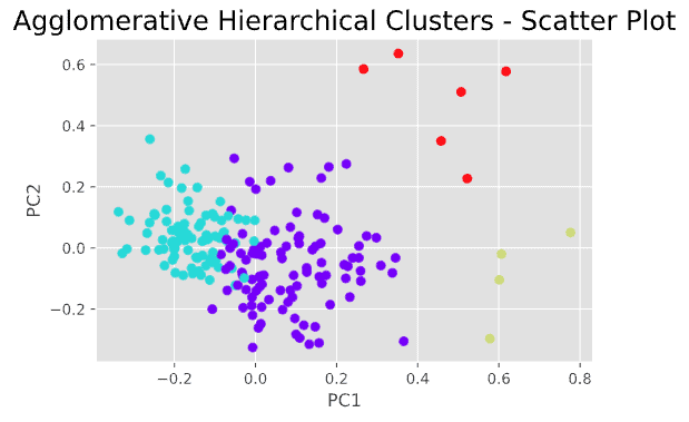
This is not bad and gives us a basic understanding of the number of possible clusters that may exist in this data and how these clusters appear in a scatter plot. However, the results of hierarchical clustering do not seem ideal, as we can see that there are some “questionable” data points that could be assigned to the wrong clusters.
Hierarchical clustering, although very useful for visualizing the clustering process through a tree structure, has some disadvantages. For example, hierarchical clustering makes only one pass through the data. This means that records allocated or misallocated at the beginning of the process cannot be reassigned later.
Therefore, we rarely stop our analysis with the hierarchical clustering solution, but rather use it to get a “visual” understanding of what clusters might look like, and then use an iterative method (e.g., k-means) to improve and refine the clustering solutions.
Using K-means
K-means is a popular clustering method by which one specifies a desired number of clusters, k, and assigns each record to one of the k clusters so as to minimize a measure of dispersion within the clusters.
It is an iterative process that assigns and reallocates data points to minimize the distance of each record from the centroid of its cluster. At the end of each iteration, some improvement is obtained and the procedure is repeated until the improvement is very small.
To perform k-means clustering, we must first specify k (number of clusters). We can do this in two ways:
- Specify k using our domain knowledge or past experience.
- Perform hierarchical clustering to get an initial understanding of the number of clusters to try.
- Use the “Elbow” method to determine k.
From the dendrogram in the previous step, we already know that k=4 (or k=5) seems to work quite well. We can also use the “elbow” method to check again. The code below plots the “Elbow” graph that tells us where the turning point is for the optimal number of clusters.
					#Elbow method
ks=range(1,20)
inertias=[]
for k in ks:
    model=KMeans(n_clusters=k)
    model.fit(PCA_components.iloc[:,:3]) #we only use the first 3 principal components
    inertias.append(model.inertia_)

plt.plot(ks,inertias, '-o',color='black')
plt.xlabel('number of clusters, k')
plt.ylabel('inertia')
plt.xticks(ks)
plt.show

The results are quite consistent with those obtained from the dendrogram: both 4 and 5 are a reasonable number of clusters to try, so let’s try k=5. The following code generates the 3D scatter plot for 5 clusters.
					#plot 3-D scatter plot
from matplotlib import pyplot
from mpl_toolkits.mplot3d import Axes3D
kmeans=KMeans(n_clusters=5, init='k-means++',random_state=42)
kmeans.fit(PCA_components.iloc[:,:3])
labels=kmeans.predict(PCA_components.iloc[:,:3])

fig = pyplot.figure()
ax = Axes3D(fig)
ax.scatter(PCA_components[0],PCA_components[1],PCA_components[2],c=labels)
pyplot.show()

Describe clusters and derive key information
Now that we have our clusters, let’s add the cluster labels to the original data frame (df_NC), export it to a .csv file, and get some observations from it.
					#Add cluster labels to the original dataset and export to csv file
df_NC['cluster_nbr']=kmeans.labels_
df_NC_clusters=pd.concat([df_NC.reset_index(drop=True),pd.DataFrame(principalComponents)],axis=1)
df_NC_clusters.to_csv('df_NC.csv')
Then using dashboard creation tools such as Tableau or Google Looker, we can visualize the clusters in terms of features, similarities and differences.


One Response