When developing applications, whether web or desktop, it is necessary to think appropriately about the interface. The branch that deals with this aspect is UX/UI Design. There are various studies that try to define the main rules to be applied and the most effective development patterns. Nevertheless, a dose of creativity and aesthetic sense is always required. There are many courses dedicated to this topic. In the course of our research, I came across a list of rules that must be considered in order to develop appealing, attractive, but above all intuitively functional interfaces. In this article we will look at some rules that can be applied whether you are an experienced designer wishing to refresh your approach or a beginner eager to learn the rules.
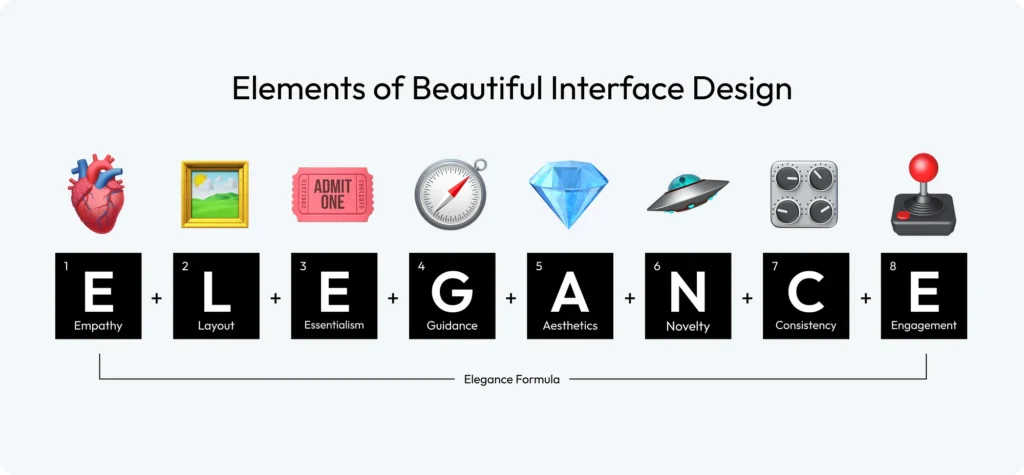
The main concepts to bear in mind when developing a user interface are as follows:
- Empathy: There is no universal concept of beauty; only when you truly understand your target audience can you create a design that appeals to them.
- Layout: Layout is the canvas of your interface; it must guide the user’s eye effortlessly, creating a continuous flow that intuitively connects each element.
- Essentialism: Embrace simplicity; every element of your design must have a purpose, as clutter can obscure the message and hinder the user experience.
- Guidance: Design should not only please the eye, but also guide the user, providing clear paths and cues for subsequent action.
- Aesthetics: Aesthetics goes beyond mere aesthetics; it encapsulates the feeling of design, creating an environment that resonates emotionally with the user.
- Novelty: Innovative designs catch the eye, but the real art lies in balancing novelty with familiarity, ensuring that users feel intrigued but comfortable.
- Consistency: Consistency in design breeds familiarity; it ensures that the user feels comfortable in the various parts of your interface, creating trust and ease of use.
- Engagement: An engaging design is like a good conversation: it keeps the user interested, responds to their actions and encourages them to return.
Below we see the rules that should guide us in interface development.
Empathy
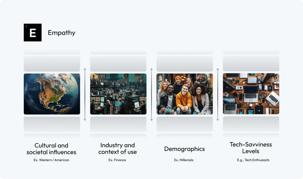
Cultural and social aspects play a crucial role in shaping users’ preferences and perceptions. You must, therefore, consider the cultural and social contexts of your audience to ensure that your design resonates widely and respectfully. Obviously, the design must respect the specific norms of the sector and the practical context in which the interface will be used.
Another aspect to consider is the profile of the end-users, i.e. the various age groups to which they belong, their professional skills and their level of technological preparation, which may influence the definition of a more personalised and effective interface.
Research conducted by the Nielsen Norman Group on different demographics – highlighting the online behaviour and expectations of young adults, the evolution of digital literacy and the specific usability needs of the elderly, as well as the different and distinct design requirements of children – emphasises the crucial importance of empathetic and user-centred design in user interface development to effectively cater for the unique characteristics and preferences of each group.
Layout
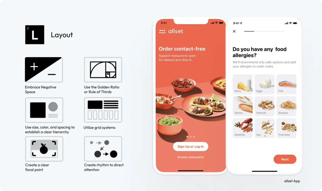
A well-planned layout does not merely arrange elements on the screen, but must create a visual symphony that directs, delights and engages users. For this reason, negative space must be used wisely to create a clean, uncluttered interface that highlights the most important elements and improves readability. Also incorporate the golden ratio or rule of thirds into your design to achieve a natural balance and aesthetically pleasing proportions.
Establishing a clear hierarchy of sizes, colours and spacing guides the user’s eye to the most significant information.
To ensure a cohesive and harmonious arrangement of elements, it is advisable to use grid systems. It is also suggested that you designate a clear focal point in your layout to capture immediate attention and direct the user’s interaction with your content, as well as create a rhythm in your layout to direct attention through rhythmic design elements such as repeated patterns or structured layouts.
Finally, consider using F and Z layouts to compare the natural scanning habits of users. Use the F pattern in text-intensive interfaces, strategically placing crucial information at the top and left.
Essentialism
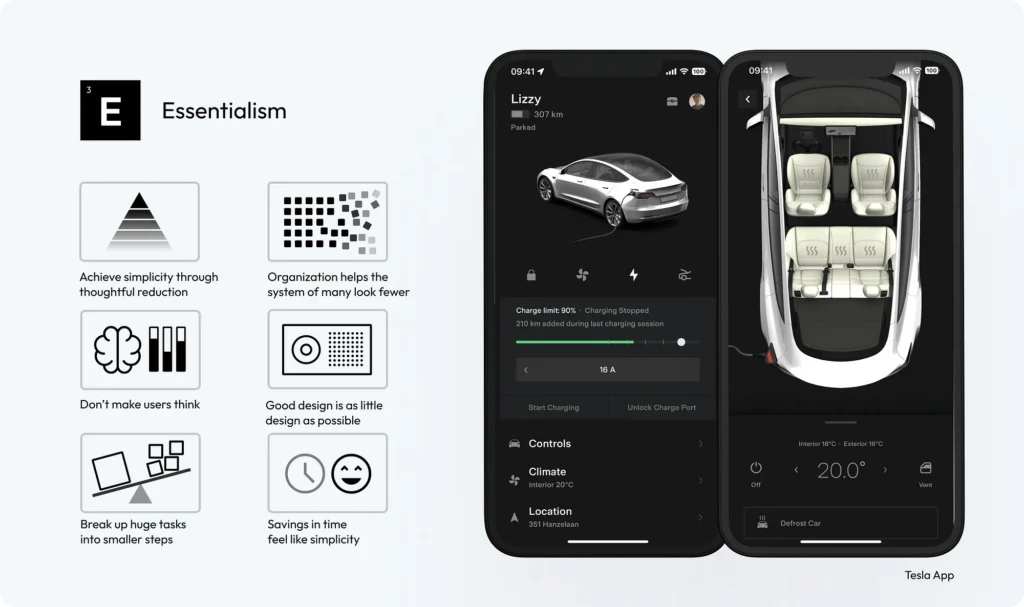
When constructing the interface, one must focus on what really matters to the user, eliminating non-essential elements. Drop-down menus or tabs can be used to organise content, to categorise and group content and functionality, thus making the interface less cluttered and more navigable. Always consider that the user does not want to think too much to perform the tasks he needs. Therefore, make sure that navigation and task flows are logical and predictable. Use common elements in the interface positioned where users expect to find them, reducing cognitive load. If your application requires you to perform complex processes, divide tasks into smaller steps and use progress bars to visually indicate the user’s progress and what remains to be done.
Although many think that you need to include a lot of elements to make the interface appealing, studies indicate that a minimalist approach is much more effective. Therefore, use only the elements necessary for functionality, avoiding excessive use of colours, fonts and graphics.
Finally, optimise loading times and streamline processes to make interactions faster. Use intelligent defaults, autocomplete functions and predictive text to speed up user input and decision-making.
Guidance
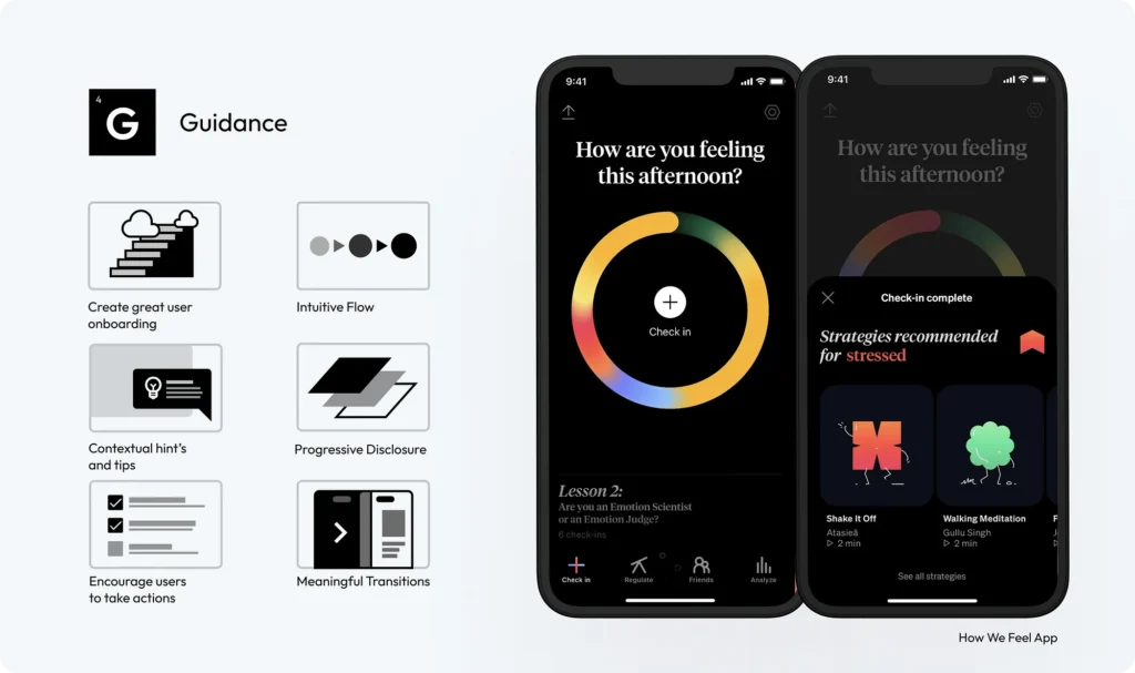
The user interface must guide the user through a digital landscape with intuition and ease. Start by designing an engaging onboarding process that educates users about your product from the very first interaction.
A logical, step-by-step flow that feels natural and requires minimal effort to navigate users improves their overall experience. To help them understand how to use the application, implement contextual assistance such as tooltips, pop-ups or inline instructions that appear when users need them. Also, show only what is needed at each stage and use clear design elements such as buttons, icons and calls to action to guide users to desired interactions, ensuring that these elements are clearly visible and easily accessible. Finally, provide immediate visual or auditory feedback for actions taken to guide the user to the next steps.
Aesthetics: typography
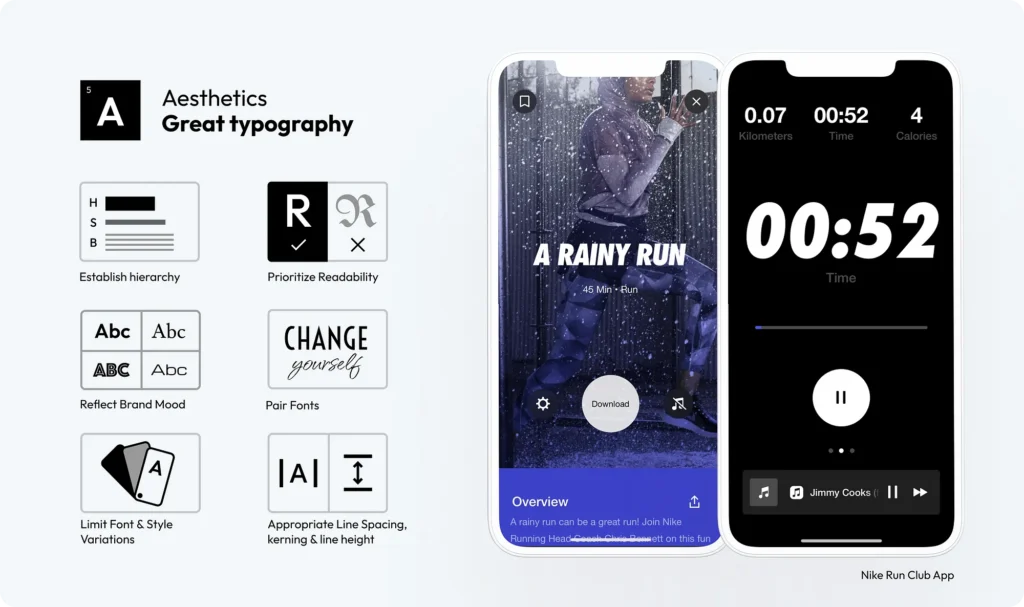
Skilfully applied typography helps to stand out, improve readability and aesthetics. Therefore, you must establish a typographic hierarchy using different font sizes, weights and styles to guide the user’s attention to the most important content.
Always prioritise readability by choosing fonts that are easy to read on different devices and screen sizes. However, the font must align with the personality of your application/brand. Whether professional, playful or elegant, the typography must reinforce the tone of the brand. In case you want to use multiple fonts, make sure they complement each other. There are many websites that provide tools and/or examples to find the best matches. You can for instance visit https://www.fontpair.co/ to find some examples. Be careful, however, not to go overboard with font and style variations. Finally, define adequate spacing between letters (kerning), words and lines to improve readability and flow of the text. Experiment with different settings to find the most pleasing and readable format.
Aesthetics: chromia
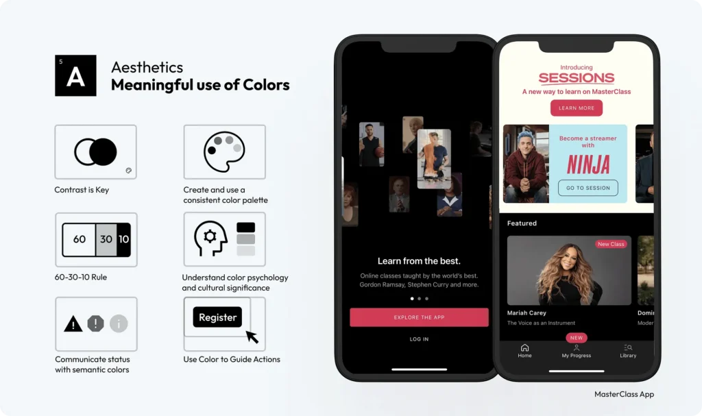
Using the right colours can make a significant difference in how users perceive and interact with a product. Develop a consistent colour palette that reflects your brand identity and use it consistently throughout the interface to maintain visual consistency. Use the 60-30-10 rule to balance colours, 60% dominant colour, 30% secondary colour and 10% accent colour. Also ensure that there is sufficient contrast between text and background to improve readability and accessibility.
When choosing colours, you must consider how different colours evoke different emotions and meanings in different cultures. Furthermore, some colours have an intrinsic semantic meaning, such as red for mistakes or green for success. Therefore, use colours strategically to highlight key actions, such as buttons or links, guiding the user’s attention to important interactions.
Aesthetics: content
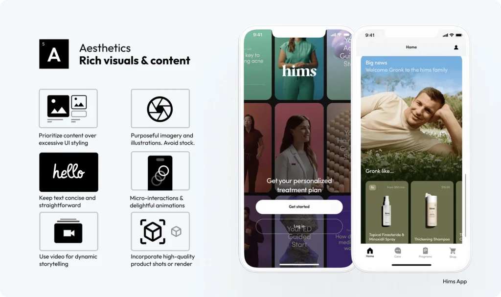
Effective visual content in user interface design improves user engagement and emotional connection. Focus on offering content through images without overloading the user with excessive user interface decoration. Let the images speak for themselves. Therefore, avoid generic stock photos and opt for customised or carefully selected images that reflect the brand identity and message. Then complement the images with a clear and concise text, avoiding long paragraphs. Better bulleted lists or short descriptions to enhance the visual message. If necessary, incorporate light animations and/or micro-interactions that enhance user engagement without distracting them from the main content.
The use of video can be a great way to tell stories or explain complex concepts in a dynamic way. Videos can be particularly effective in conveying messages that are difficult to express through static images. If you are developing an e-commerce, use high-quality photographs or 3D renderings of products in addition to videos. Detailed and attractive product images can significantly increase user interest and sales.
Novelty
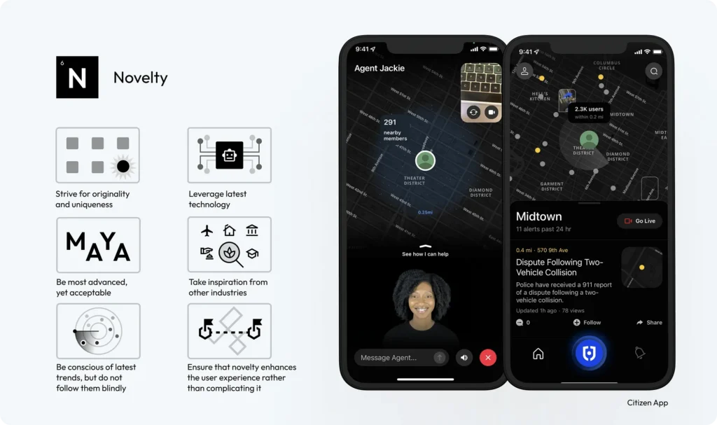
Innovative or unique interfaces will create memorable experiences, leading to greater user satisfaction. The designs you create must stand out with both original concepts and unique elements, differentiating your product from competitors. Take full advantage of emerging technologies and incorporate them into your design to deliver cutting-edge experiences. Don’t overdo it!!! Always ensure that your designs remain user-friendly and accessible to your target audience.
If you lack ideas to make your design unique, look beyond the field of UI design for inspiration, drawing creative insights from art, architecture, nature and more. Also stay abreast of the latest design trends, but don’t follow them blindly. Innovations must always serve a purpose, improving the overall user experience without adding unnecessary complexity. Finally, always keep in mind that you must maintain your own specific and unique identity.
Consistency
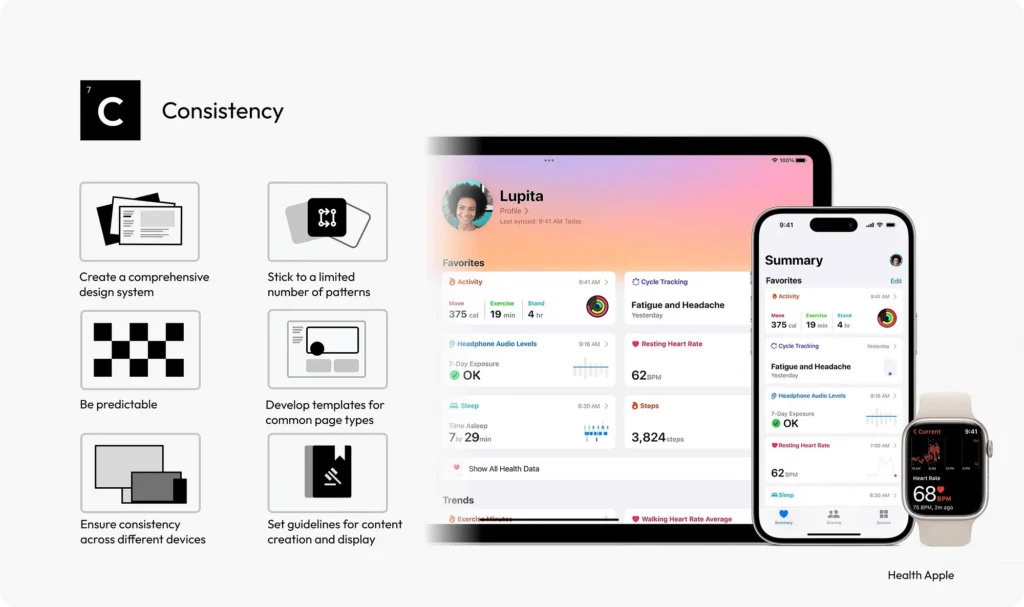
A design system acts as a single source of truth for all design elements, ensuring uniformity of all aspects of the user interface. The use of a consistent set of design patterns simplifies the user interaction model, making the interface more predictable and easy to use. Interface elements must also behave consistently throughout the application so that users know what to expect. If you have to develop pages for a site that are standard, use templates as they provide a consistent structure, facilitating user navigation and content understanding.
In general, consistency within your interface creates a sense of familiarity and helps create trust and confidence. Keep the user interface consistent across devices and platforms by also standardising tone, style and content formatting.
Engagement
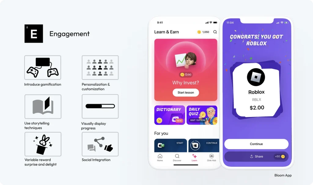
The key to the success of many applications and sites is user involvement. Today, strategies such as gamification help to enhance this. You can, for example, include game mechanics such as points, badges and leaderboards to motivate users and encourage interaction. Also offer users the opportunity to personalise their experience. Customisation can increase the relevance of the interface to the individual user, enhancing engagement.
