
Google Data Studio – Introduction
Before starting, this is the second part of the Google Data Studio tutorial to learn the basic features of the platform (accessible on https://datastudio.google.com). In particular, we are going to enrich our project started during the introduction by focusing on tables and charts. If you are uncertain about how to initiate a new report and properly prepare the environment, it is suggested to consult the previous tutorial.
Include charts
Since everything has been set, it is time to proceed with the actual data visualization. If you click on the Add a chart menu in your Google Data Studio project, different graphs typologies can be observed. They are all interesting and suitable for different tasks. However, we will only cover the most useful ones since they share common functionalities.
In fact, when a new chart is added, Data Studio will automatically select one metric among the available ones. As always, use the right panel for proper customisation. Next to the metric name you have the aggregation function acronym (e.g. SUM, AVG) which can be generally modified for other kinds of database. By clicking on the acronym box, the associated editing menu will appear. It also allows you to modify the displayed metric name, as it can be appreciated in Figure 1.
You should pay special attention to Default date range command. If you want a fixed reference period, select Custom, otherwise it will be automatically adapted to the general date range selection. You can either manually select the range or using the common proposed ones.
The Scorecard
This simple element is extremely direct and useful to briefly summarize significant metrics. From the menu, select one Scorecard and choose where to place it. Besides the stylistic adjustments, this block is compact and intuitive. However, you have a fascinating Comparison date range option (Default data range section) to highlight trends of given time periods.

Usually, it is interesting to select Previous period which will automatically provide the comparison with respect to the currently selected date range, using different colours depending on whether it is a positive or negative trend. Remember: help your viewers to correctly interpret the reported information. You should always rename objects and include texts to make your dashboard clear.
Question 1.
Insert 4 Scorecards to summarize the video performance with the layout you prefer. Include Watch time and User Comments Added, both being independent from the report date range (i.e. providing cumulative results). Concerning Views and User Subscription Added, set the automatic date range and the comparison time with the previous period. By changing the period range from the report date control, check that they properly work as expected.
TIP.
When setting the chart default date range to Custom, you can select the automatic range among the proposed ones to refer to the whole available database.
Time series
In order to investigate the evolution over time of some metrics, Time series graphs are usually employed. They are useful to identify specific patterns and trends. In particular, you can visualize more metrics on the same graph. Then, similarly to Scorecards, it is possible to compare the metric evolution with previous periods. You can play with the different possibilities from the right panel, as usual.
Question 2.
Include two time series to your report. The first one showing the evolution of views number by overlapping the selected date range with the corresponding previous period. For the second graph instead, represent the Video Shares trend with custom date range to show the whole database period, independently from the general date selector. In this case, from the style section, include also a reference line to compare the evolution with the mean value.
TIP.
An effective chart should take into account all the details. Always check that the main elements are present and correct, including grids, legends, axis labels, etc… For better analysis, you can also decide to replace lines with bars from the style section.
Pie chart
Probably one of the most popular graphs, the Pie chart is ideal for instantly clarify the data distribution according to specific characteristics. The implementation is simple, but you have several style options to play with. They are essential to better match the considered information and be consistent with the report purpose.
Question 3.
When analyzing online traffic, it is important to understand the geographical origin. Use the pie chart to gain insights about the main countries in terms of total views. Finally, spend some time to tune the stylistic appearance. In particular, set the proper number of slices, shape and colours to make the graph clear and readable.
Geographic chart and Google Maps
The most suitable strategy to successfully represent geographical data is certainly the use of maps. From the chart menu, you have different possibilities. By clicking on Google Maps, you will obtain a map you are probably more familiar with. In fact, also the street view option is available to make the chart extremely interactive.
Observe that Data Studio will automatically select the proper geographical dimension if present. However, it is interesting to notice how you can easily highlight different aspects by setting Country Code and US State Code. In fact, the database allows you to have a more specific overview of US within the map. Finally, you can evaluate the geographical distribution of all the available metrics.
Question 4.
Support the previous pie chart with the standard Geo chart to include a world map about the number of views.
Bar chart and filters in Google Data Studio
The final important element is the Bar chart, which is useful for several analysis. The basic idea is clearly similar to the previous ones. In our case, we would like to test the horizontal bar chart for inspecting the US traffic.
Question 5.
Place the chart into your report and select the US State Code dimension. Concerning this analysis, we are interested in the following metrics to have a complete overview: Video Likes, Video Dislikes, Video Shares and Likes Removed. Sort them according to Views. You should obtained a coloured multi-bar graph. However, the first entry has no label. Can you figure out why?
TIP.
Never simply report the data! You should always check for consistency. In fact, information frequently requires to be filtered. Use the Filter section of the right panel to define a new filter, as in the example of Figure 2. Try to identify the proper rule for our case.

After the filtering process, you can customize the chart style and observe the final result. It is useful to infer interesting considerations about users response in different regions. This proves the importance of generating consistent reports. Companies and authors can deeply understand the performance by comparing different factors and feedback.
Style and layout in Google Data Studio
At this point, we have explored the main elements of Google Data Studio. Organize the report layout to provide clear information by including the mentioned charts. If needed, from the Page menu, you can manage and add new pages to your report. Feel free to explore the other available functionalities to highlight any additional insights you consider relevant. Individually customise each single component to achieve a final project that is both pleasant and valuable.
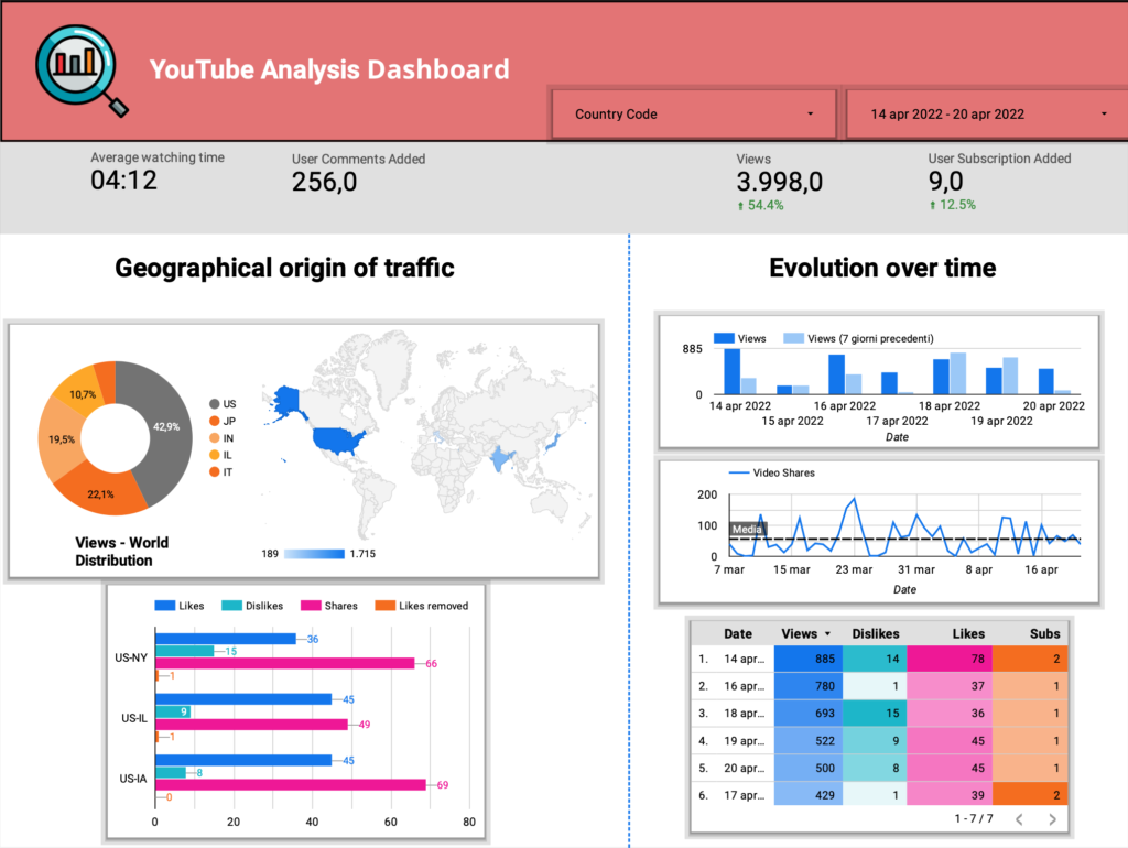
Important: test your final report in View mode by varying your selectors to check that everything has been correctly set. Eventually, you can download the PDF from the File menu. Figure 3 shows a possible solution.


One Response