Summary and objectives
Similarly to what we have observed with Kibana, Google Data Studio is an interesting free tool for data visualization, allowing users to design dashboards and graphical reports. Several options are available, ensuring high customization to represent data, including in particular tables and graphs. They can easily support financial analytics and summary visualization.
During this laboratory activity, you will explore the basic functionalities and possibilities behind this platform. The main focus is devoted to understand the environment and to become familiar with the crucial concepts. Among the others, they are necessary to properly deal with real databases and produce a first comprehensive data report.
Getting started with Google Data Studio
First of all, connect to https://datastudio.google.com by using your personal Google account. Clearly, it is similar to other popular Google services, like Drive and Docs. The homepage intuitively provides your recent projects and data sources, as shown in Figure 1. You can access your own projects and the ones shared with you as well, since you can decide to allow other participants to contribute.

Pre-built templates
Before creating a new report from scratch, it is suggested to explore the templates gallery in order to observe the potentiality of the platform and different examples which can be useful for future projects design.
Data sources and connectors
The first crucial element for a new report is the employed database. Similarly to reports, you can browse your previously configured data sources which are included through the use of specific connectors. They represent the bridge to import your data into your reports. Data Studio provides two main categories: the official Google Connectors (e.g. Google Analytics, Google Sheets) and the Partner Connectors proposed by third-party entities (e.g. Twitter, Facebook), according to the database origin.
Creating your new Google Data Studio report
Once provided the general overview of the platform, it is time to create your first report and directly investigate the most important functionalities.
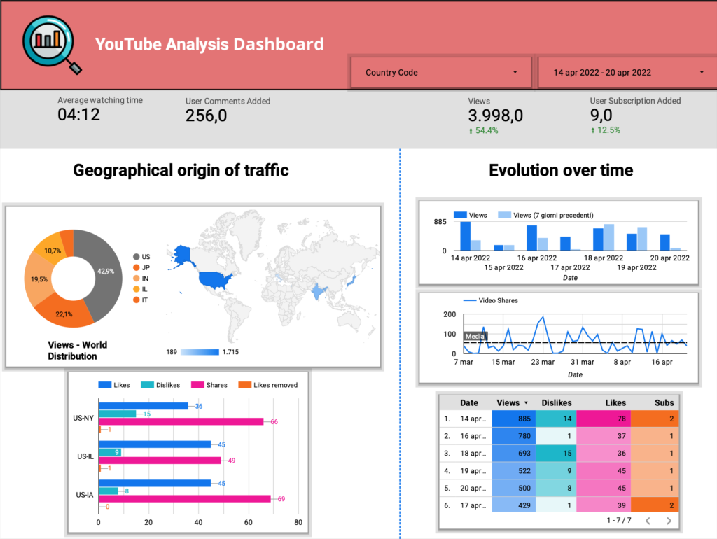
Click on Create report to begin and you will be asked to select the desired connector for the data source in order to link your personal resources with Data Studio. For example, using the Google Sheets Connector, you can authorize the system to browse your personal files. In this case instead, we are interested to access the free samples provided for testing purpose. Use the My data sources button and then select ”[Sample] YouTube Data”. This database consists of collected information about a YouTube video sample to analyze useful insights, including views, comments, dislikes and so on (with constant updates).
After confirming the intention to add the selected data to the report, a table will appear. From the right panel you can investigate the database structure and associated fields. A first important distinction should be made:
- Dimensions, representing specific categories of data.
- Metrics, being the actual measurements to quantify some information.
Exploring your data
This preliminary step should be never underestimated. In fact, in order to detect interesting patterns and produce appealing analysis, you should always have perfect awareness of your data. In particular, Google Data Studio provides you an intuitive interface to explore both the available dimensions (green) and metrics (blue).
Using the generated table, you can easily observe the database, by including more columns and sorting them as you prefer. Therefore, spend some time to play with these functionalities to better understand the available information. As shown in Figure 2, the top menu allows to visualize data in a more extended manner by clicking on Resource.

Question 1.
Edit the table using the right panel. Set Country Code as dimension and report the following metrics: Watch Time, Video Shares, Video Likes Added, Views. Finally, sort your results according to Views descending order.
TIP.
Although it was automatically generated with the connector selection, the table is not mandatory to keep. If it is unnecessary for your final report, you can safely delete it. On the contrary, if it is useful, you can customise the table according to your preferences, like re-sizing the columns (i.e. right click on the table) or editing the style.
Set the title and the header
Moving on to new fundamental elements, the basic one is certainly related to the possibility of including texts and additional components. An effective report requires to be clear and – most importantly – to be self-explanatory.
The highlighted toolbox in Figure 3 offers interesting elements to make the report more readable and complete. Of course, the simplest way to gain confidence is to create a suitable header for your dashboard, since you have started with a blank paper.

Question 2.
Details are important. After re-naming the project, include a customised header which matches your personal taste. Exploit the different components (e.g. images, shapes).
TIP.
You should notice that each selected element from the report presents two distinct columns within the right panel: ”Data” and ”Style”. For instance, from the latter one, you could highlight specific pattern for each column of the table with heat maps and bars.
Add controls and View mode
When performing data analysis, it is often preferred to observe the results under some conditions only. For example, from Add a control you can insert a box devoted to date range selection. This is extremely useful for making the report more interactive by offering the possibility to observe charts referring to different periods of time. In fact, if you click on the top right button View shown in Figure 4, you will exit the editor mode. In this way, you simulate what other viewers are expected to watch once your report has been completed. You should notice that the date selection is still interactive.

However, our report is basically empty and we now need to include some graphs for our analysis before changing the considered period. Therefore, keep in mind this function and return to the editor mode.
Question 3.
Controls are in general useful to let viewers filter your data. Add to the report a drop-down list to select the desired Country code.
TIP.
Remember that the data range selection will affect the entire report and all the displayed charts. In order to keep the period fixed for a specific component, you should individually set the reference time by using the corresponding right panel (Default data range).


One Response