Web App creation can be done with various programming languages and frameworks. The latter greatly simplify the development of an application, but the realization of some components, sometimes, requires advanced knowledge and integration of other programming languages. Today, the creation of dashboards to visualize and navigate data is increasingly in demand. Unfortunately, this task is on the back burner for data scientists, whose work is primarily oriented towards data analysis. In many cases, they opt for off-the-shelf software that includes dashboard creation simply by drag-and-drop. One example is Kibana, discussed in the articles Kibana: let’s explore data and Kibana: build your own dashboard. However, this involves using specialized databases, such as Elasticsearch, or formatting the data so that it can be read correctly by the software.
Streamlit is a free, open-source, all-Python framework that allows you to quickly build interactive dashboards and machine learning web applications without requiring any front-end web development experience. With a basic knowledge of Python, you can create and share web apps in a matter of hours, not weeks or even months. If you want a taste of the potential of this framework, you can visit the gallery of some user-built projects.
In this tutorial, after seeing how to install Streamlit on our machine, we’ll build an interactive dashboard that displays house prices in the United States on a map.
Why Streamlit?
What is the motivation that should drive you to use Streamlit to build a web app? As mentioned earlier there are various tools that enable data analysis and visualization. In addition to Kibana, we can mention Tableau and Knime. Some of them, however, are paid or have limitations on the ability to adapt to the code you want to develop.
Streamlit is all in python and allows you to create dashboards or data applications with just a few lines of code without needing to have any knowledge of front-end web application development. What’s more, it’s free! So, if you are a data scientist, a freelancer, or just thinking about developing a data analytics application, I highly recommend exploring Streamlit and adding it to your toolkit because of its simplicity, flexibility, scalability, and free.
How to install Streamlit
To install Streamlit I recommend you to use Anaconda. If you don’t have it installed simply visit the Anaconda download page and download the version for your operating system.
At this point, let’s create our own environment using Anaconda’s navigator.
Follow the detailed instructions provided by Anaconda to create and manage your environment using the Anaconda navigator. The environment for this tutorial we will call streamlit_example. Once the environment is created, open the Terminal in the new environment and install Streamlit with the following command.
pip install streamlit 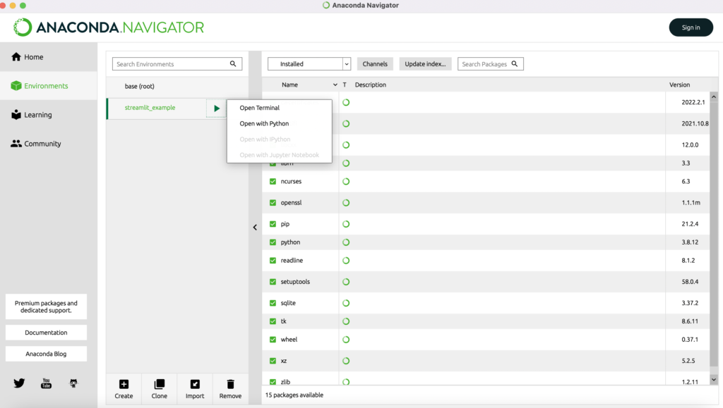
To verify that the installation was successful, type the following command in the terminal.
streamlit hello If there were no problems the welcome page will open in your browser.
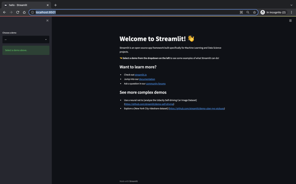
Besides streamlit you also install the packages folium, streamlit_folium and geopandas with the following commands.
pip install folium
pip install streamlit_folium
pip install geopandas
Prerequisites
Immediately create a directory for the project inside of which will be the file my_first_app.py. Launch Streamlit by opening Anaconda Navigator by clicking on ‘Environments’, then choose the environment you created earlier, and click on ‘Open Terminal’. In the anaconda environment terminal, move to your project directory. Then type the following command to launch Streamlit.
streamlit run my_first_app.py A new browser will open with empty content for now.
Click on the menu icon in the upper right corner and select ‘Settings’.
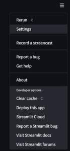
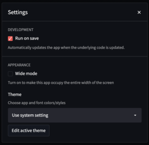
In the Settings window, select ‘Run on save’ so that whenever you make a code change it will automatically be reflected in the Streamlit web app.
Datasets
Before creating the app, we need to download the datasets needed for this tutorial. We will use two of them that are free.
Dataset Redfin U.S. Housing Market Data
Connect to Redfin and scroll down the page to the ‘How it Works’ section. Choose the Country level data in the last place in the list. Of course you can use the other data as well, but it requires you to modify the code to display the details with different granularity.
Dataset U.S. State Boundaries
Visit public.opendatasoft.com and scroll down to the Geographic File Formats section. Download the geojson file defines the geographic boundaries/coordinates of each U.S. state that we will display with the choropleth map. If you are not familiar with geojson files or the choropleth map, don’t worry because in the tutorial we will see how to use them.
Data preparation
Move the data to your project folder and copy the following code into the my_first_app file.
Import Python Libraries
import pandas as pd
import folium
import geopandas as gpd
from folium.features import GeoJsonPopup, GeoJsonTooltip
import streamlit as st
from streamlit_folium import folium_static

@st.cache
def read_csv(path):
    return pd.read_csv(path, compression='gzip', sep='\t', quotechar='"')

#Data prepartion to only retrieve fields that are relevent to this project
housing_price_df=read_csv('state_market_tracker.tsv000.gz')
housing_price_df=housing_price_df[['period_begin','period_end','period_duration','property_type','median_sale_price','median_sale_price_yoy','homes_sold','state_code']]
housing_price_df=housing_price_df[(housing_price_df['period_begin']>='2020-10-01') & (housing_price_df['period_begin']<='2022-03-01')]

#st.write(housing_price_df)

@st.cache
def read_file(path):
    return gpd.read_file(path)

#Read the geojson file
gdf = read_file('us-state-boundaries.geojson')
#st.write(gdf.head())

#Merge the housing market data and geojson file into one dataframe
df_final = gdf.merge(housing_price_df, left_on="stusab", right_on="state_code", how="outer")
df_final=df_final[['period_begin','period_end','period_duration','property_type','median_sale_price','median_sale_price_yoy','homes_sold','state_code','name','stusab','geometry']]
df_final= df_final[~df_final['period_begin'].isna()]

st.write(df_final.head())
In the code above, some important things to note/remember.
Streamlit reads and executes your script from top to bottom. Whenever something is changed in the code or a user interacts with the app (such as applying filters), Streamlit re-executes the entire Python script from top to bottom.
Second, Streamlit provides a caching mechanism that allows your app to remain performant when loading, reading, or manipulating large amounts of data. This is done with the @st.cache decorator.
In this case, for example, without caching, every time a user interacts with the app and/or the app is updated, the data is reloaded and recalculated, which could make the app slow and lead to a poor user experience. With caching, the data is only loaded into the app once. The next time the cached function is called, if nothing has changed since the function input, Streamlit will simply skip executing the function and, instead, return the previously cached output.
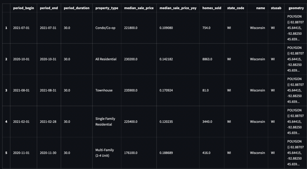
Finally, you can use st.write() to write arguments to the app. The arguments you want to pass to the app could be any number of things, such as a data frame, a graph, a string, a function, etc. In the code above we write the data frame df_final to the app to visualize what the final data looks like.
When you save your code, a table representing df_final will appear in the app. After looking at the data and getting a good understanding of all the fields (you can refer to Redfin’s data dictionary), you can comment out the st.write() command since we won’t be displaying this table in the final app.
Develop the Streamlit app
Now that the data is ready, let’s start creating the app using Streamlit. First, let’s add a sidebar in our app to display some introductory information about this app or a disclaimer. We’ll also add a title and subtitle in the app’s main interface.
#Add sidebar to the app
st.sidebar.markdown("### My first Awesome App")
st.sidebar.markdown("Welcome to my first awesome app. This app is built using Streamlit and uses data source from redfin housing market data. I hope you enjoy!")

#Add title and subtitle to the main interface of the app
st.title("U.S. Real Estate Insights")
st.markdown("Where are the hottest housing markets in the U.S.? Select the housing market metrics you are interested in and your insights are just a couple clicks away. Hover over the map to view more details.")
After saving the code, you will see that the web app is also re-executed/updated automatically and it looks like the following.

Let’s then add some filters that provide users with the flexibility to filter the data. We insert three filters in the same row creating three columns as shown in the following code.
#Create three columns/filters
col1, col2, col3 = st.columns(3)

with col1:
     period_list=df_final["period_begin"].unique().tolist()
     period_list.sort(reverse=True)
     year_month = st.selectbox("Snapshot Month", period_list, index=0)

with col2:
     prop_type = st.selectbox(
                "View by Property Type", ['All Residential', 'Single Family Residential', 'Townhouse','Condo/Co-op','Single Units Only','Multi-Family (2-4 Unit)'] , index=0)

with col3:
     metrics = st.selectbox("Select Housing Metrics", ["median_sale_price","median_sale_price_yoy", "homes_sold"], index=0)

Aesthetically very nice, but when users select different filter options, how does Streamlit take those inputs and filter the data accordingly? For example, if a user wants to look at the median sales price for each state based on the most recent month and only for single-family homes, how do we pass these filters to our data frame?
To update df_final based on the user’s selections, using the following code. You can write the data frame in the app and try changing the filters to check that they work correctly (be sure to comment out st.write after you’re done testing).
#Update the data frame accordingly based on user input
df_final=df_final[df_final["period_begin"]==year_month]
df_final=df_final[df_final["property_type"]==prop_type]
df_final=df_final[['period_begin','period_end','period_duration','property_type',metrics,'state_code','name','stusab','geometry']]

st.write(df_final)
Add the map of Choropleth
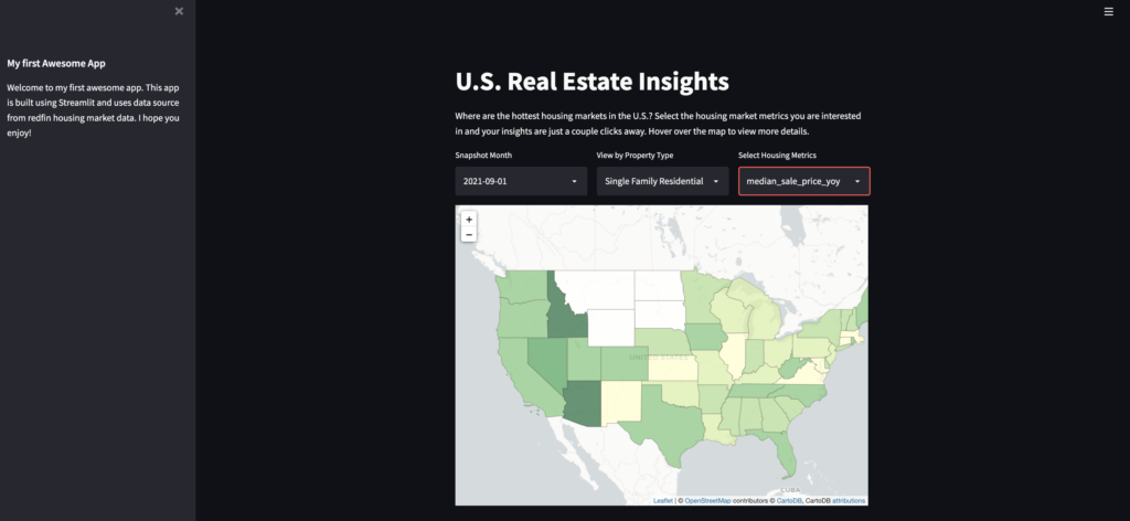
Now that the data is ready, let’s insert the Choropleth map. We use the following code to create the Folium map that displays U.S. housing market data for different time periods, property types, and valuation metrics, depending on user input.
In the code, lines 2 and 3 start a blank map of the United States and set the default center position of the map to (40, -100). Lines 6 through 18 create the corpuscle map based on user input on the three filters. Pay attention to line 10 which determines the shading of each state based on the ‘metric’ parameter passed by the third filter.
#Initiate a folium map
m = folium.Map(location=[40, -100], zoom_start=4,tiles=None)
folium.TileLayer('CartoDB positron',name="Light Map",control=False).add_to(m)

#Plot Choropleth map using folium
choropleth1 = folium.Choropleth(
    geo_data='us-state-boundaries.geojson',     #This is the geojson file for the Unite States
    name='Choropleth Map of U.S. Housing Prices',
    data=df_final,                                  #This is the dataframe we created in the data preparation step
    columns=['state_code', metrics],                #'state code' and 'metrics' are the two columns in the dataframe that we use to grab the median sales price for each state and plot it in the choropleth map
    key_on='feature.properties.stusab',             #This is the key in the geojson file that we use to grab the geometries for each state in order to add the geographical boundary layers to the map
    fill_color='YlGn',
    nan_fill_color="White",
    fill_opacity=0.7,
    line_opacity=0.2,
    legend_name='Housing Market Metrics',
    highlight=True,
    line_color='black').geojson.add_to(m)

folium_static(m)
The result we will get is as follows.
Great! However, it would be interesting if we could also show some information about each state when users hover over the map. So, let’s add tooltips to the map by inserting the following code before folium_static(m).
#Add tooltips to the map
geojson1 = folium.features.GeoJson(
               data=df_final,
               name='United States Housing Prices',
               smooth_factor=2,
               style_function=lambda x: {'color':'black','fillColor':'transparent','weight':0.5},
               tooltip=folium.features.GeoJsonTooltip(
                   fields=['period_begin',
                           'period_end',
                           'name',
                           metrics,],
                   aliases=["Period Begin:",
                            'Period End:',
                            'State:',
                            metrics+":"],
                   localize=True,
                   sticky=False,
                   labels=True,
                   style="""
                       background-color: #F0EFEF;
                       border: 2px solid black;
                       border-radius: 3px;
                       box-shadow: 3px;
                   """,
                   max_width=800,),
                    highlight_function=lambda x: {'weight':3,'fillColor':'grey'},
                   ).add_to(m)
That’s it! You’ve created your first interactive dashboard/web app using Streamlit. Starting from this example and leveraging the power of Streamlit you can think about building your own interactive apps in no time.
All the code is available in the github repository. If you want to use the app you can connect to Streamlit Cloud.



One Response