Kibana is the data visualization tool of ELK stack. As seen in article What is Kibana used for?, there are several functionalities available. In addition to visualization, it is possible, for example, to use machine learning models to identify anomalies in the data and to set up custom alerting systems. The management of users, their roles and workspaces can be done through simple and intuitive interfaces. Even integration with external systems for logs capture and analysis is driven by graphical interfaces.
Kibana, however, was born as a tool to visualize the data saved within Elasticsearch. The potentialities of representation are really a lot. To discover them we will illustrate in this tutorial how to add test data and analyze it with the main tools.
Import sample data
Sample data is provided along with examples of visualizations, dashboards, and more to help you explore the functionality of Kibana before importing your own data.
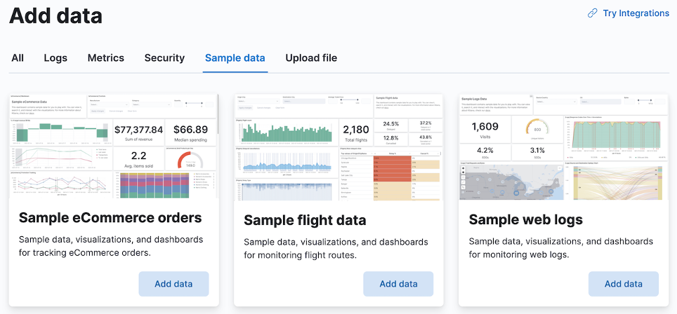
- In the home page, click on “Try our sample data”.
- On the Sample eCommerce orders tab, click Add data
Explore data
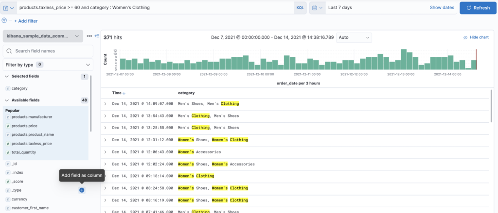
The Discover page displays the data in an interactive histogram showing the distribution of the data, or documents, over time, and a table listing the fields for each document that matches the index template. To view a subset of the documents, you can apply filters to the data and customize the table in order to display only the fields of interest.
- Open the main menu, then click on Discover
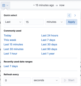
- Change time filter to Last 7 days
- To view sales orders for women’s clothing that have a cost greater than or equal to $60, use the KQL search field:
products.taxless_price >= 60 and category : Women's Clothing 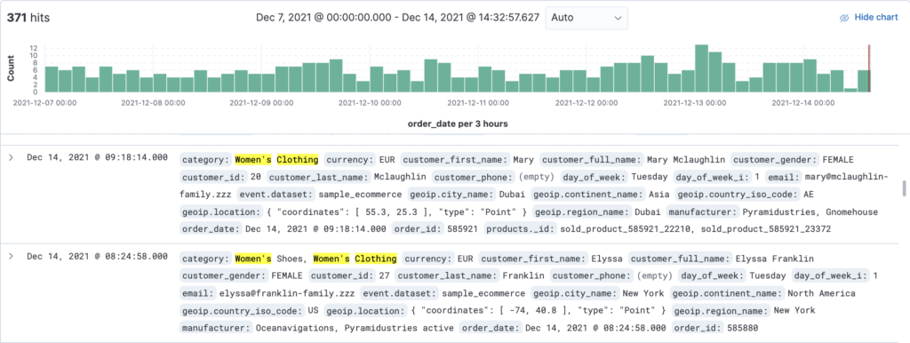
- To view only product categories that contain sales orders, move your mouse over the category field and then click on +
View and analyze data
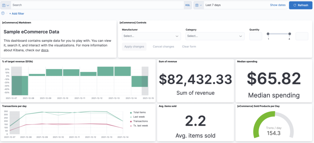
A dashboard is a set of panels for viewing and analyzing data. Panels contain visualizations, interactive controls, text, and more.
- Open the main menu, then click Dashboard
- Click on [eCommerce] Revenue Dashboard
Create a view panel
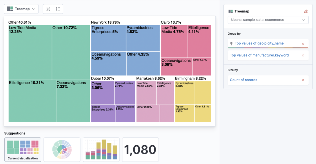
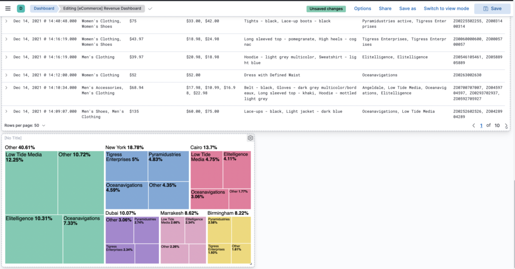
Create a treemap panel that shows the top sales regions and manufacturers, then add the panel to your dashboard.
- In the toolbar click

- In the dashboard click

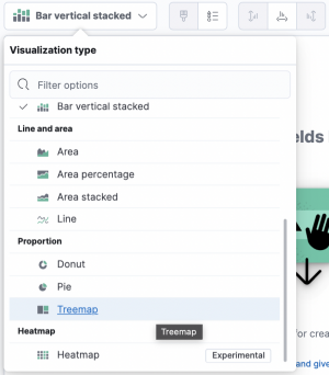
- In the drag-and-drop visualization editor, open the Visualization type drop-down menu, then select Treemap.
- From the Available fields list, drag the following fields into the workspace:
- geoip.city_name
- manufacturer.keyword
- Click
 . The treemap appears as the last display panel on the dashboard.
Interact with data
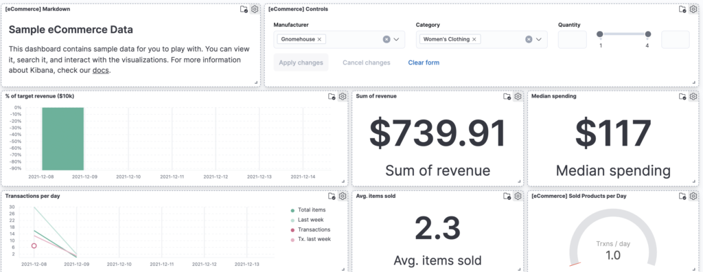
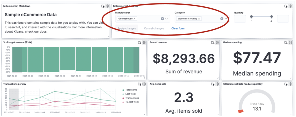
You can interact with dashboard data using controls that allow you to apply filters at the dashboard level. Interact with the [eCommerce] Controls panel to view women’s clothing data from manufacturer Gnomehouse.
- From the Manufacturer drop-down menu, select Gnomehouse
- From the Category drop-down menu, select Women’s Clothing
- Click Apply changes
Filter data
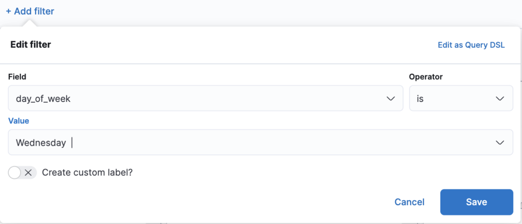
To view a subset of the data, you can apply filters to the dashboard panels. Apply a filter to view women’s clothing data generated on Wednesday by the producer Gnomehouse.
- Click Add filter
- From the Field drop-down menu, select day_of_week
- From the Operator drop-down menu, select is
- From the Value drop-down menu, select Wednesday
- Click Save
