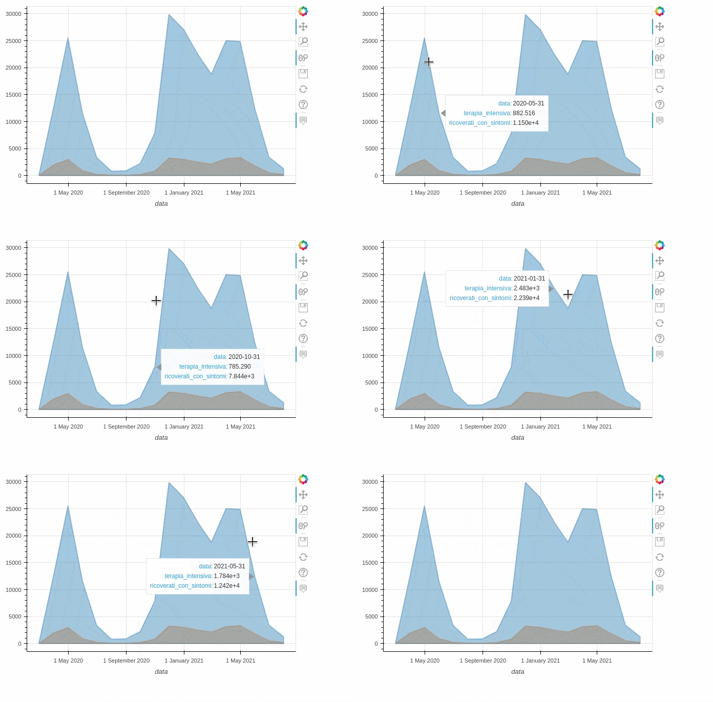
Data visualization is one of the fundamental aspects of data analysis. Exploring the nature of the data and its distribution allows the data analyst to understand how to analyze it. In addition, visualizing analysis results allows for immediate communication of the result of complex analyses.
Choosing a library to display data and/or results is sometimes complicated. In fact, there are several libraries that are easy to use but limit interaction with the data itself. Others, however, allow interaction with graphs but the learning curve is steep. However, there are open-source libraries that partially solve this problem.
We have seen in the article PandasGUI: Graphical user interface for analyzing data with Pandas how we can use a tool to interact with data through a graphical interface. However, if we want to include graph generation within our code, we need to use other libraries.
In this article, we will compare the pandas and pandas_boken library. We will analyze the syntax and the results obtained by comparing some available types of graphs. In particular, we will limit ourselves to six basic graphs, namely line graphs, bar graphs, stacked bar graphs, histograms, scatter and pie graphs. The goal is to make the graphs interactive so that we can take full advantage of the information they present to us.
Dataset
There are many public datasets with which you can test these tools. For example, on Kaggle you can download free datasets covering a variety of areas, from financial data to weather data. There are also several repositories that provide so-called open data, i.e. free data published online.
In this tutorial we will use the open data about the COVID-19 cases in Italy available here. We will not do an analysis of that data, but we will only use it to show the functionality of the libraries. In particular, we will use the national trend data and focus only on the hospitalizations data. You can download the dataset here.
Before installing the library we recommend that you create your own development environment. To do this you can simply use pipenv. This way you will install only the libraries you need for your project in a dedicated workspace and not at the operating system level. So after creating your workspace with pipenv shell, you can proceed with the installation of Pandas and Pandas_bokeh. The commands are as follows.
# from PyPi
pip install pandas-bokeh

# with Conda
conda install -c patrikhlobil pandas-bokeh
At this point we can import the necessary libraries and dataset.
# Importing required modules
import pandas as pd
import pandas_bokeh
import numpy as np
import matplotlib.pyplot as plt
%matplotlib inline
# Reading in the data
data = pd.read_csv('covid.csv',parse_dates=["data"],index_col='data')
data.head()
With the last command we can see the DataFrame read from the csv file. As you can see there are 23 columns (attributes) for each date. To simplify we select only the data related to hospitalizations, i.e. the columns hospitalized_with_symptoms (i.e., ricoverati_con_sintomi) and intensive_care(i.e., terapia_intensiva). In addition, to have fewer points to display we can resample the time series data using the pandas resample() command. Below we report the commands and the output obtained.
Out[1]:
stato  ricoverati_con_sintomi  terapia_intensiva  ...  totale_positivi_test_antigenico_rapido  tamponi_test_molecolare  tamponi_test_antigenico_rapido
data                                                                  ...
2020-02-24 18:00:00   ITA                     101                 26  ...                                     NaN                      NaN                             NaN
2020-02-25 18:00:00   ITA                     114                 35  ...                                     NaN                      NaN                             NaN
2020-02-26 18:00:00   ITA                     128                 36  ...                                     NaN                      NaN                             NaN
2020-02-27 18:00:00   ITA                     248                 56  ...                                     NaN                      NaN                             NaN
2020-02-28 18:00:00   ITA                     345                 64  ...                                     NaN                      NaN                             NaN

[5 rows x 23 columns]


data = data[['ricoverati_con_sintomi', 'terapia_intensiva']]

In [2]: data.head()
Out[2]:
                     ricoverati_con_sintomi  terapia_intensiva
data
2020-02-24 18:00:00                     101                 26
2020-02-25 18:00:00                     114                 35
2020-02-26 18:00:00                     128                 36
2020-02-27 18:00:00                     248                 56
2020-02-28 18:00:00                     345                 64

In [3]: data_resample = data.resample(rule='M').mean()

In [4]: data_resample
Out[4]:
            ricoverati_con_sintomi  terapia_intensiva
data
2020-02-29              222.833333          53.666667
2020-03-31            12762.612903        1985.645161
2020-04-30            25565.800000        2975.466667
2020-05-31            11501.645161         882.516129
2020-06-30             3353.800000         207.433333
2020-07-31              808.741935          57.870968
2020-08-31              890.451613          58.129032
2020-09-30             2204.833333         194.566667
2020-10-31             7843.870968         785.290323
2020-11-30            29880.800000        3231.666667
2020-12-31            27113.612903        3005.516129
2021-01-31            22392.354839        2483.451613
2021-02-28            18799.535714        2128.571429
2021-03-31            25040.580645        3127.032258
2021-04-30            24889.600000        3306.833333
2021-05-31            12422.516129        1783.645161
2021-06-30             3408.100000         531.966667
2021-07-31             1248.000000         179.400000
Now that we have our dataframes ready, it’s time to visualize them via different graphs.
Plot syntax
The two libraries we will use to generate the plots are the one provided by pandas and the pandas_brokeh library. We see below the syntax provided by both.
Pandas
To generate a plot using pandas, you use the .plot() method of the dataframe. This method is a simple wrapper around matplotlib’s plt.plot(). You can also specify some additional parameters such as those below.
Some of the important Parameters
--------------------------------

x : label or position, default None
    Only used if data is a DataFrame.
y : label, position or list of label, positions, default None
title: title to be used for the plot
X and y label: Name to use for the label on the x-axis and y-axis.
figsize : specifies the size of the figure object.
kind : str
    The kind of plot to produce:

    - 'line' : line plot (default)
    - 'bar' : vertical bar plot
    - 'barh' : horizontal bar plot
    - 'hist' : histogram
    - 'box' : boxplot
    - 'kde' : Kernel Density Estimation plot
    - 'density' : same as 'kde'
    - 'area' : area plot
    - 'pie' : pie plot
    - 'scatter' : scatter plot
    - 'hexbin' : hexbin plot.
For a complete list of parameters and their usage, see the official documentation.
Pandas bokeh
The Pandas bokeh library provides a bokeh plotting backend for Pandas, GeoPandas and Pyspark DataFrames by adding the plot_bokeh() method. It requires you to define at the beginning one plotting method among two possible ones: Jupyter notebook or HTML file. The syntax is as follows.
# for embedding plots in Jupyter Notebooks.
pandas_bokeh.output_notebook()
# for exporting plots as HTML.
pandas_bokeh.output_file(filename)
Comparison of different plots
In this section we show both the commands and the results for different chart types. In particular we will analyze the types:
- Line charts
- Scatter
- Histograms
- Bar Charts
- Stacked bar charts
- Pie charts
Line charts
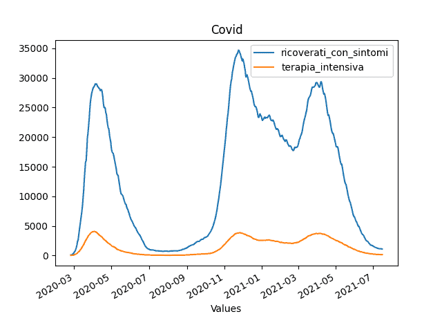
#pandas
data.plot(title='Covid', xlabel='Values').figure.show()

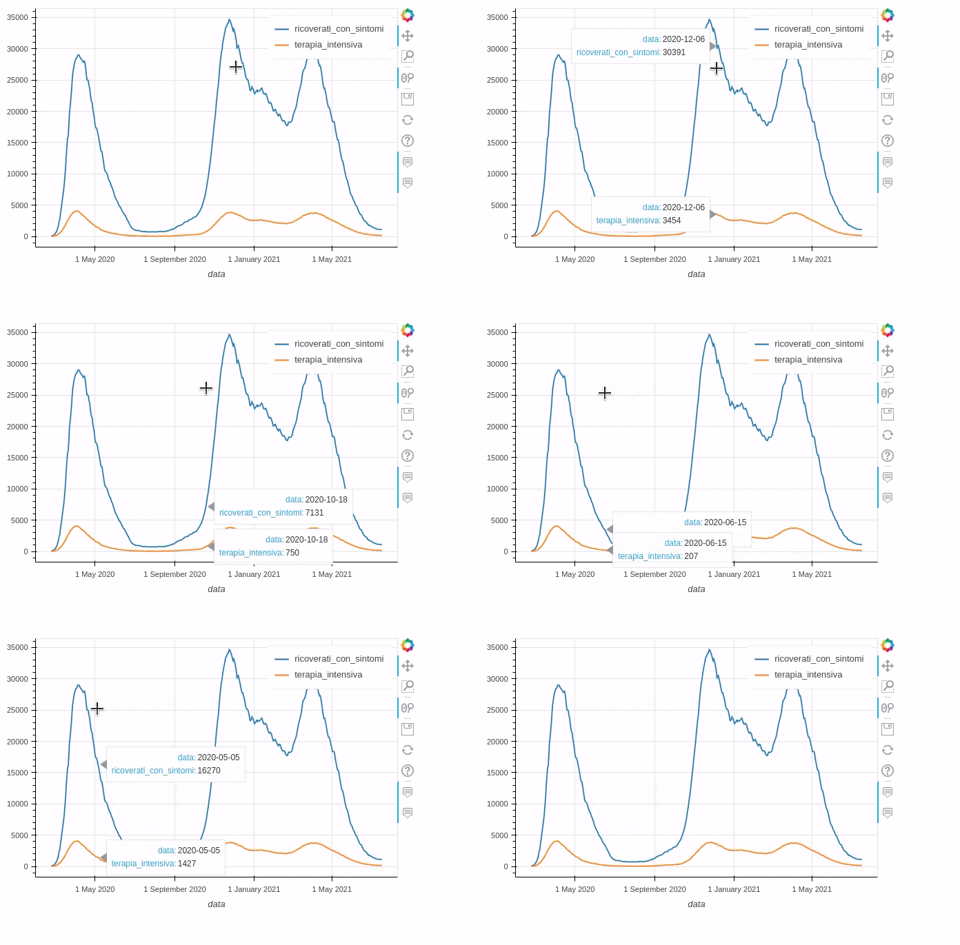
# pandas_bokeh
data_new.plot_bokeh(kind='line')
Pandas
Bokeh
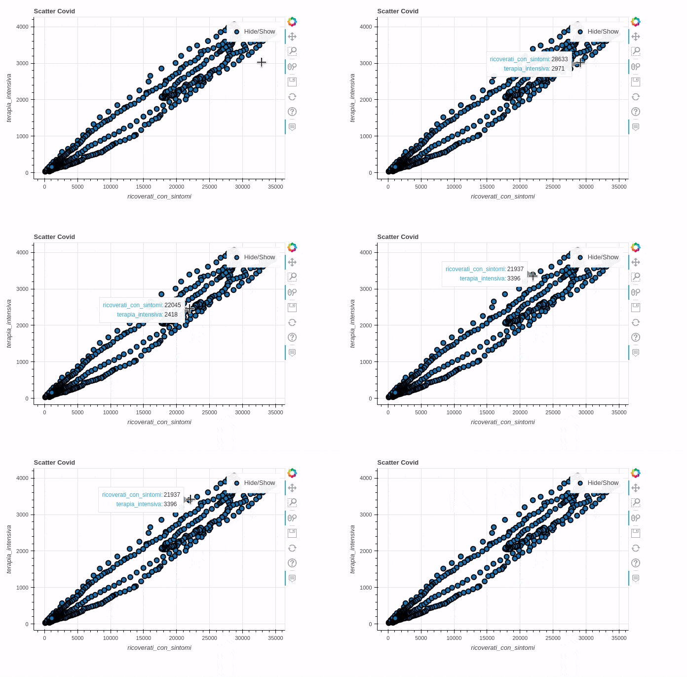
Scatter plot
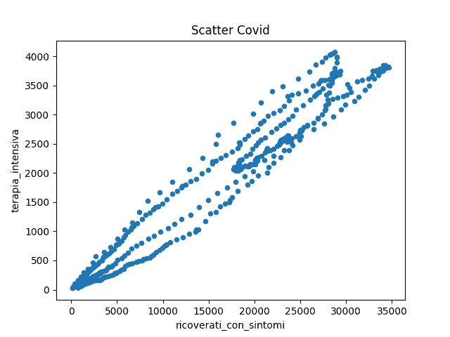
#pandas
data.plot(kind='scatter',
    x='ricoverati_con_sintomi',
    y='terapia_intensiva',
    title='Scatter Covid').figure.show()

# pandas_bokeh
data_new.plot_bokeh.scatter(x='ricoverati_con_sintomi',
    y='terapia_intensiva',
    title='Scatter Covid')
Pandas
Bokeh
Histograms
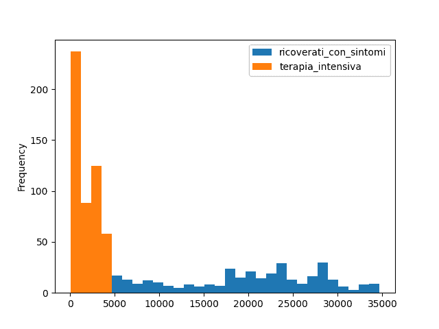
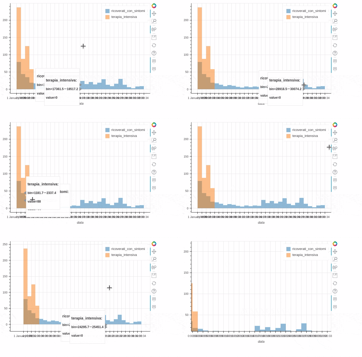
#pandas
data.plot(kind='hist', bins=30).figure.show()

# pandas_bokeh
data.plot_bokeh(kind='hist', bins=30)
Pandas
Bokeh
Bar Charts
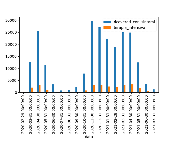
#pandas
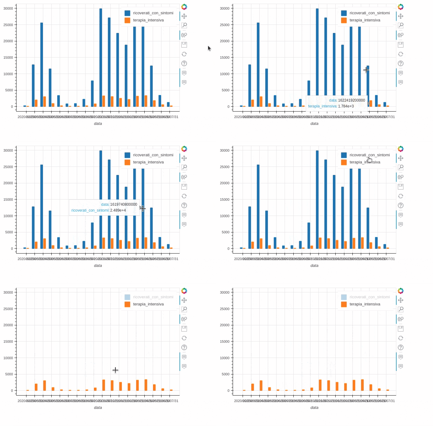
data_resample.plot(kind='bar').figure.show()

# pandas_bokeh
data_resample.plot_bokeh(kind='bar')
Pandas
Bokeh
Stacked bar charts
#pandas
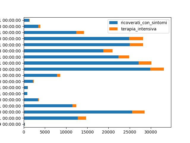
data_resample.plot(kind='barh', stacked=True).figure.show()

# pandas_bokeh
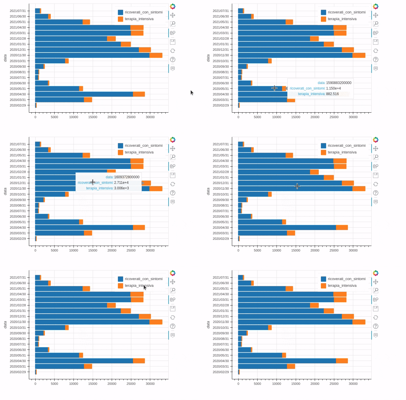
data_resample.plot_bokeh(kind='barh', stacked=True)
Pandas
Bokeh
Pie charts
#pandas
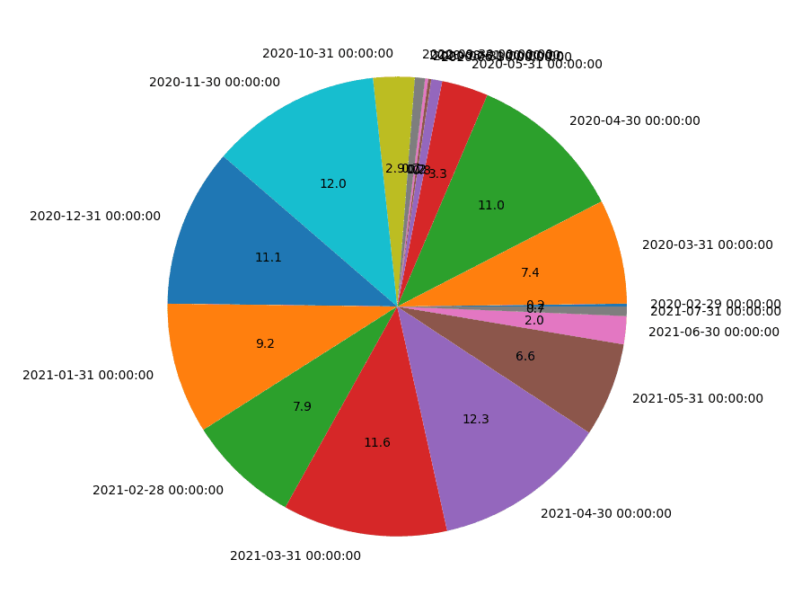
data_resample['terapia_intensiva'].plot.pie(legend=False, autopct='%.1f').figure.show()

# pandas_bokeh
data_resample.plot_bokeh.pie(y='terapia_intensiva')
Pandas
Bokeh
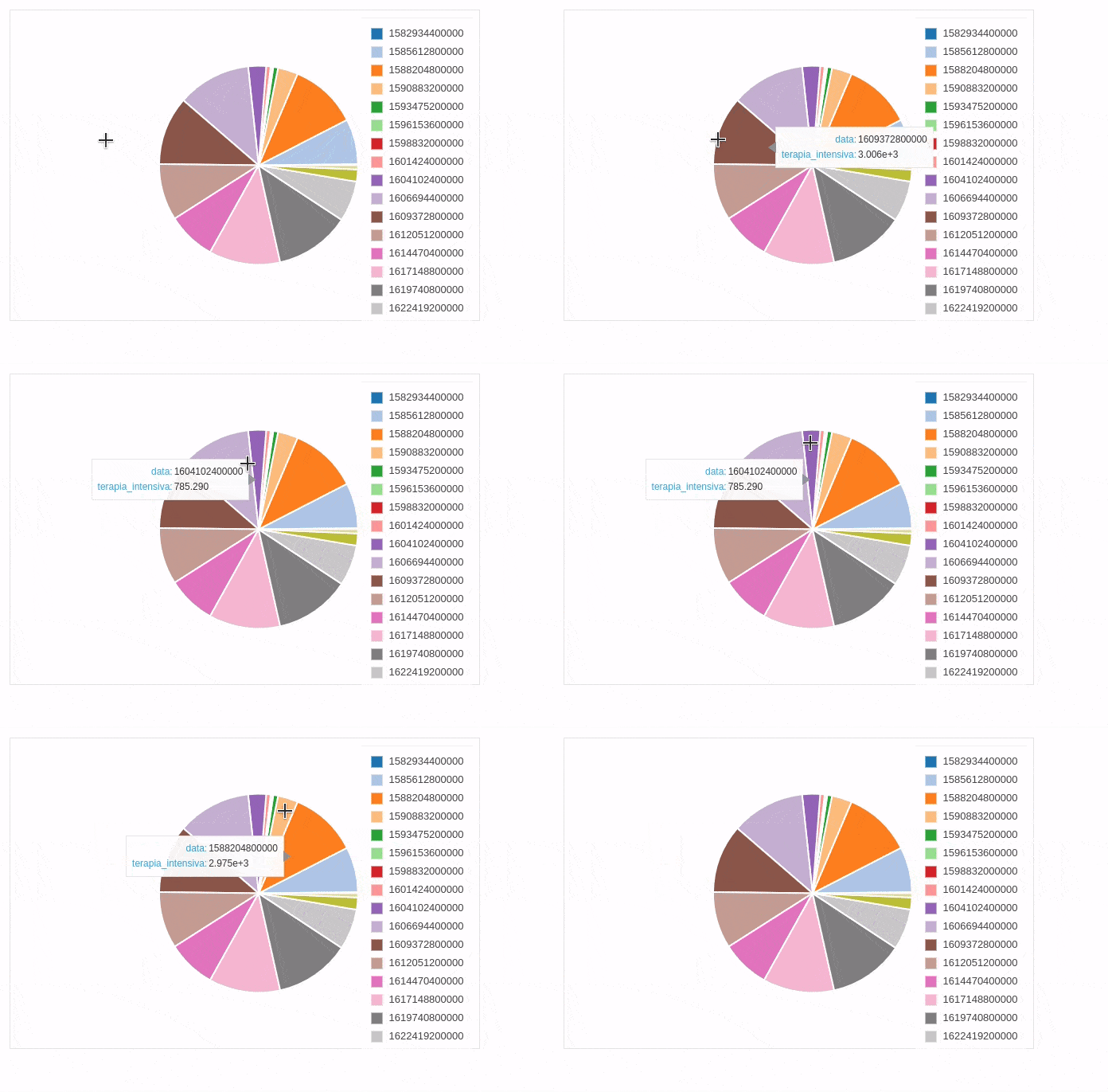
For this chart type, Bokeh also provides another type of output that incorporates multiple pie charts. The syntax and result are shown below.
data_resample.plot_bokeh.pie() 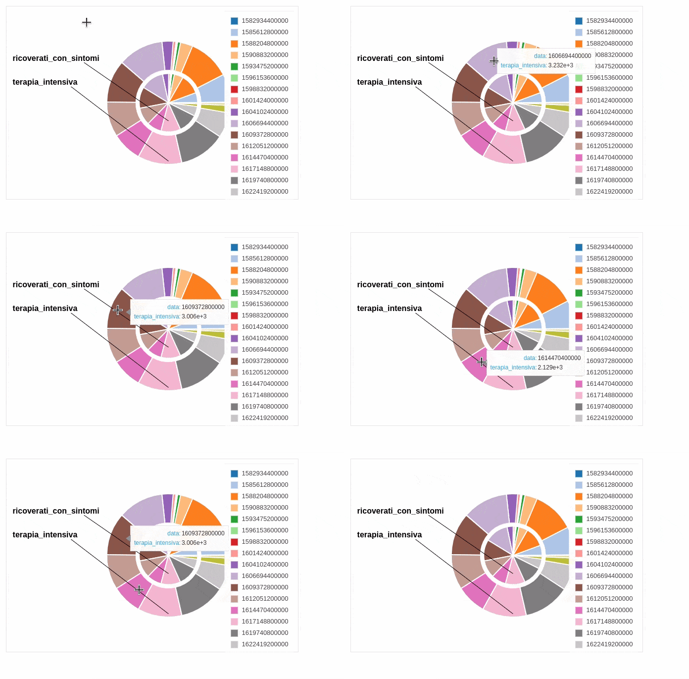
Conclusions
Pandas provides an excellent library for generating graphs of the data contained in DataFrames. However, these graphs lack interactivity and capabilities such as zooming and panning. The Pandas Bokeh library overcomes this limitation by also providing HTML output that can be easily included in websites. Obviously, the use of one library over another depends on the application context and preferences of the developer or data analyst.
