In the tutorial Streamlit: Build a Web App in minutes, we saw how to create an interactive dashboard for visualizing and filtering data in minutes with Streamlit. As a reminder, Streamlit is a free, open-source, all-Python framework that allows you to quickly build interactive dashboards and web apps without any front-end web development experience/skills. First introduced in 2019, it has quickly gained popularity among data science professionals and enthusiasts.
The app we built in the previous tutorial was very simple but illustrated the potential of Streamlit. In this article, we will build a real estate market analysis app similar to the previous one but with some more functionality and data. We will also discuss in detail some concepts and features that can greatly improve the usability of the app:
- Use st.sidebar to organize input widgets for a cleaner interface
- Use st.forms and st.form_submit_button to group input widgets and submit data using only one button
- Add tooltips to input widgets to provide useful information to users
- Use st.expander to insert a container that shows additional information only when expanded
- Use st.image to add the logo of your website/brand
Datasets
We will use the data sources already presented in the Streamlit: Build a Web App in minutes tutorial but we will not use the same data. Connect, then, to Redfin and scroll down to the How it works section. Download the data at the County level. Since we will be creating an interactive map in the application, we also need to get the geojson file that defines the geographic boundaries of each county. From public.opendatasoft.com, go to the ‘Geographic File Formats’ section and download the geojson file for the U.S. county boundaries.
Unfortunately, the Redfin dataset does not contain the state FIPS code, which is a unique identifier for each state and which we will use later as a key to link to the geojson file. Therefore, we need to download a third file that has both state names and FIPS codes. You can download the county_fips file here. The data was extracted from nrcs.usda.gov.
Preparing data
Since the goal of this tutorial is to explore and learn various features of Streamlit based on the app we created in article Streamlit: Build a Web App in minutes, we bring you the code to put inside the my_app_v2.py file. We have included some comments to illustrate the main operations that are performed. For more information you can re-read the previous tutorial.
# Import Python Libraries
import pandas as pd
import folium #to install folium using Anaconda: conda install -c conda-forge folium
import geopandas as gpd #to install geopandas, run this code in the conda terminal: conda install geopandas
from folium.features import GeoJsonTooltip
import streamlit as st #You can follow the instructions in the beginner tutorial to install Streamlit if you don't have it
from streamlit_folium import folium_static

@st.cache
def read_csv(path):
    return pd.read_csv(path, compression='gzip', sep='\t', quotechar='"')

housing_price_df=read_csv('county_market_tracker.tsv000.gz') #Replace ... with your file path
housing_price_df=housing_price_df[(housing_price_df['period_begin']>='2020-10-01') & (housing_price_df['period_begin']<='2021-10-01')] #only look at past 12 months' data
county_fips=pd.read_csv('county_fips.csv', sep='\t')
county_fips['region']=county_fips["Name"] + ' County, '+ county_fips["State"] #Create a new column called 'region' which is the concatenation of county name and state. This column will be used in the next step to join housing_price_df with county_fips

housing_price_df= housing_price_df.merge(county_fips, on="region", how="left")
housing_price_df['FIPS'] = housing_price_df['FIPS'].astype(str).replace('\.0', '', regex=True)
housing_price_df["county_fips"] = housing_price_df["FIPS"].str.zfill(5)

@st.cache
def read_file(path):
    return gpd.read_file(path)

#Read the geojson file
gdf = read_file('georef-united-states-of-america-county.geojson')

#Merge the housing market data and geojson file into one dataframe
df_final = gdf.merge(housing_price_df, left_on="coty_code", right_on="county_fips", how="outer") #join housing_price_df with gdf to get the geometries column from geojson file
df_final= df_final[~df_final['period_begin'].isna()]
df_final = df_final[~df_final['geometry'].isna()]
df_final=df_final[['period_begin','period_end', 'region','parent_metro_region','state_code',"property_type",'median_sale_price','median_sale_price_yoy','homes_sold','homes_sold_yoy','new_listings',
                   'new_listings_yoy','median_dom','avg_sale_to_list',"county_fips",'geometry']]
df_final.rename({'median_sale_price': 'Median Sales Price',
                 'median_sale_price_yoy': 'Median Sales Price (YoY)',
                 'homes_sold':'Homes Sold',
                 'homes_sold_yoy':'Homes Sold (YoY)',
                 'new_listings':'New Listings',
                 'new_listings_yoy':'New Listings (YoY)',
                 'median_dom':'Median Days-on-Market',
                 'avg_sale_to_list':'Avg Sales-to-Listing Price Ratio'},
                 axis=1, inplace=True)

#st.write(df_final.head())
Remember to set in the Settings the option Run on save so you can see immediately the modifications made to the code. Moreover, if you want to see, for debugging purposes, the table of the imported data, uncomment the instruction st.write.
Add a sidebar
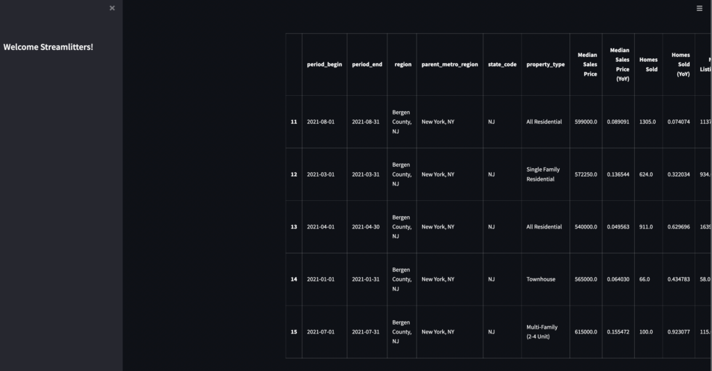
First, we’ll add a sidebar to the app that contains a “Welcome Streamlitters” welcome message. The sidebar feature is great for organizing all of your interactive input widgets into one section and is expandable/collapsible to allow users to focus on the content.
#Adding a sidebar to the app
st.sidebar.title("Welcome Streamlitters!")
The result we will get is as follows.
Add filters/input widgets
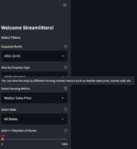
Unlike the app in the previous tutorial, we want to add some filters to interact with the data in the sidebar. The filters are implemented using several widgets including st.selectbox, st.radio, st.slider etc. To add the widgets to the sidebar and not in the main interface, simply use the widgets associated with the sidebar such as st.sidebar.selectbox, st.sidebar.radio, etc.
To help the user in using these filters, we will add a tooltip to each widget by simply assigning a text to the help parameter.
#Add filters/input widgets with tooltips
st.sidebar.markdown("Select Filters:")
period_list=df_final["period_begin"].unique().tolist()
period_list.sort(reverse=True)
year_month = st.sidebar.selectbox("Snapshot Month", period_list, index=0, help='Choose by which time period you want to look at the metrics. The default is always the most recent month.')

prop_type = st.sidebar.selectbox(
            "View by Property Type", ['All Residential', 'Single Family Residential', 'Townhouse','Condo/Co-op','Single Units Only','Multi-Family (2-4 Unit)'] , index=0, help='select by which property type you want to look at the metrics. The default is all residential types.')

metrics = st.sidebar.selectbox("Select Housing Metrics", ["Median Sales Price","Median Sales Price (YoY)", "Homes Sold",'Homes Sold (YoY)','New Listings','New Listings (YoY)','Median Days-on-Market','Avg Sales-to-Listing Price Ratio'], index=0, help='You can view the map by different housing market metrics such as median sales price, homes sold, etc.')

state_list=df_final["state_code"].unique().tolist()
state_list.sort(reverse=False)
state_list.insert(0,"All States")
state = st.sidebar.selectbox("Select State", state_list,index=0, help='select to either view the map for all the states or zoom into one state')

homes_sold=st.sidebar.slider("Sold >= X Number of Homes", min_value=1, max_value=500, value=10,help='Drag the slider to select counties that sold at least x number of homes in the snapshot month. By defaut we are showing counties that sold at least 10 homes in the snapshot month.')
The graphical result will be as follows.
Now you need to provide the user’s selections to the data frame in order to filter them.
# Pass the user input to the data frame
df_final=df_final[df_final["period_begin"]==year_month] #only show rows with period_begin equal to whatever selected by user as the time period
df_final=df_final[df_final["property_type"]==prop_type] #only show rows with property type equal to user's selection
df_final=df_final[df_final["Homes Sold"]>=homes_sold] #only show rows with at least X number of homes sold based on user's selection

#Define a function so that if user select 'all states' we'll show data for all the states. Otherwise only show data for whatever state selected by user
def state_filter (state):
   if state=='All States':
       df=df_final
   else:
       df=df_final[df_final["state_code"]==state]
   return df
df_final=state_filter(state)

#Quickly check whether the slicing and dicing of the dataframe works properly based on user's input
st.write(df_final)
Remember to comment out the st.write function at the beginning to see only the filtered data. The result you will get will be similar to the one below.
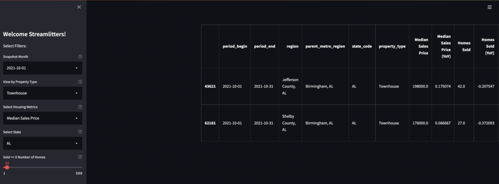
This solution is great from a graphical point of view but not optimal in terms of performance. In fact, every time the user interacts with a widget or a filter, the application runs again and updates the data accordingly. This might not be critical if you only have a couple of filters or the dataframe is not very large. However, imagine when you have a complex machine learning model with many input widgets and large data. In this case re-executing the code at every user interaction could lead to slowdown of the app.
How is it possible to solve this problem? Fortunately, Streamlit has introduced a pair of commands called st.form and st.form_submit_button to specifically address this problem. You can use these commands to group input widgets and send their values with the click of a button, which will only trigger a single repetition of the entire app.
Widget forms
Let’s see how we can modify our code to use forms and the submit button to group widgets. Forms can be declared using the with statement and can include more than one widget.
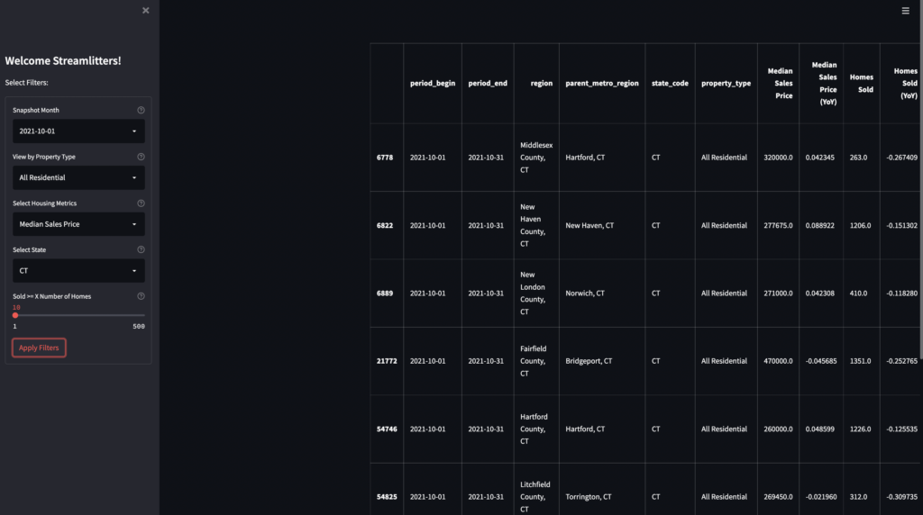
The following code creates a form that contains 5 widgets and a submit button called ‘Apply Filters’. This way, users can interact with the widgets as much as they want without causing the code to run again. To apply the filters and update the application, the user will have to click on the submit button of the form.
Replace the code related to the widgets with the following. Remember not to delete the part about passing the filter values to the dataframe.
#Add filters/input widgets with tooltips
st.sidebar.markdown("Select Filters:")
#Use forms and submit button to batch input widgets
with st.sidebar.form(key='columns_in_form'):
    period_list=df_final["period_begin"].unique().tolist()
    period_list.sort(reverse=True)
    year_month = st.selectbox("Snapshot Month", period_list, index=0, help='Choose by which time period you want to look at the metrics. The default is always the most recent month.')

    prop_type = st.selectbox(
                "View by Property Type", ['All Residential', 'Single Family Residential', 'Townhouse','Condo/Co-op','Single Units Only','Multi-Family (2-4 Unit)'] , index=0, help='select by which property type you want to look at the metrics. The default is all residential types.')

    metrics = st.selectbox("Select Housing Metrics", ["Median Sales Price","Median Sales Price (YoY)", "Homes Sold",'Homes Sold (YoY)','New Listings','New Listings (YoY)','Median Days-on-Market','Avg Sales-to-Listing Price Ratio'], index=0, help='You can view the map by different housing market metrics such as median sales price, homes sold, etc.')

    state_list=df_final["state_code"].unique().tolist()
    state_list.sort(reverse=False)
    state_list.insert(0,"All States")
    state = st.selectbox("Select State", state_list,index=0, help='select to either view the map for all the states or zoom into one state')

    homes_sold=st.slider("Sold >= X Number of Homes", min_value=1, max_value=500, value=10,help='Drag the slider to select counties that sold at least x number of homes in the snapshot month. By defaut we are showing counties that sold at least 10 homes in the snapshot month.')

    submitted = st.form_submit_button('Apply Filters')
The interface will look slightly different than before.
Populate main interface
Right now the main interface only contains the table of possibly filtered data. We are starting to add a title, a logo, an expander, and finally the map that displays real estate market metrics at the county level.
Add title and logo
st.columns is a very useful command that allows you to insert containers arranged as columns side by side. We will use it, therefore, to create two columns so that we can add the title and logo side by side.
#Add a title and company logo
from PIL import Image
image = Image.open('.../Insights_Bees_logo.png')

col1, col2 = st.columns( [0.8, 0.2])
with col1:
    st.title("U.S. Real Estate Insights")
with col2:
    st.image(image,  width=150)
Remember to comment out the display of the dataframe. Otherwise, the newly inserted container will be displayed immediately after the table.
Add an expander under the title
We can also add an expander below the title to provide information about the app. The expander can be expanded or compressed to provide more detail while saving space in the app, which is a nice feature to take advantage of.
#Add an expander to the app
with st.expander("About the App"):
     st.write("""
         This app is created using Redfin Data Center's open data (https://www.redfin.com/news/data-center/) to visualize various housing market metrics across the U.S. states at county level. Areas that are white on the map are the counties that don't have data available. Select the filters on the sidebar and your insights are just a couple clicks away. Hover over the map to view more details.
     """)
Add map
Now let’s insert the map into the main interface of the app. Simply enter the following code to create a map using Folium. This map will display U.S. housing market data by month, property type, and housing market metrics (e.g., median sales price, homes sold, sales/listings ratio, etc.).
#Create a choropleth map
col1, col2 = st.columns( [0.7, 0.3])
with col1:
    us_map = folium.Map(location=[40, -96], zoom_start=4,tiles=None)
    folium.TileLayer('CartoDB positron',name="Light Map",control=False).add_to(us_map)
    custom_scale = (df_final[metrics].quantile((0,0.6,0.7,0.8,0.9, 1))).tolist()

    folium.Choropleth(
            geo_data='.../georef-united-states-of-america-county.geojson',
            data=df_final,
            columns=['county_fips', metrics],  #Here we tell folium to get the county fips and plot the user-selected housing market metric for each county
            key_on='feature.properties.coty_code', #Here we grab the geometries/county boundaries from the geojson file using the key 'coty_code' which is the same as county fips
            threshold_scale=custom_scale, #use the custom scale we created for legend
            fill_color='YlGn',
            nan_fill_color="White", #Use white color if there is no data available for the county
            fill_opacity=0.7,
            line_opacity=0.2,
            legend_name='Measures',
            highlight=True,
            line_color='black').geojson.add_to(us_map) #by using .geojson.add_to() instead of .add_to() we are able to hide the legend. The reason why we want to hide the legend here is because the legend scale numbers are overlapping


    #Add Customized Tooltips to the map
    feature = folium.features.GeoJson(
                    data=df_final,
                    name='North Carolina',
                    smooth_factor=2,
                    style_function=lambda x: {'color':'black','fillColor':'transparent','weight':0.5},
                    tooltip=folium.features.GeoJsonTooltip(
                        fields=['period_begin',
                                'period_end',
                                'region',
                                'parent_metro_region',
                                'state_code',
                                "Median Sales Price",
                                "Median Sales Price (YoY)",
                                "Homes Sold",'Homes Sold (YoY)',
                                'New Listings','New Listings (YoY)',
                                'Median Days-on-Market',
                                'Avg Sales-to-Listing Price Ratio'],
                        aliases=["Period Begin:",
                                    'Period End:',
                                    'County:',
                                    'Metro Area:',
                                    'State:',
                                    "Median Sales Price:",
                                "Median Sales Price (YoY):",
                                "Homes Sold:",
                                'Homes Sold (YoY):',
                                'New Listings:',
                                'New Listings (YoY):',
                                'Median Days-on-Market:',
                                'Avg Sales-to-Listing Price Ratio:'],
                        localize=True,
                        sticky=False,
                        labels=True,
                        style="""
                            background-color: #F0EFEF;
                            border: 2px solid black;
                            border-radius: 3px;
                            box-shadow: 3px;
                        """,
                        max_width=800,),
                            highlight_function=lambda x: {'weight':3,'fillColor':'grey'},
                        ).add_to(us_map)

    folium_static(us_map)

with col2:
    markdown_metrics = '<span style="color:black">**Metric**: '+metrics + '</span>'
    st.markdown(markdown_metrics, unsafe_allow_html=True)  #Overlay a text to the map which indicates which metric is shown on the choropleth map
In the code above, lines 4 through 20 initialize a blank map of the United States and set the default center location of the map to (40, -96). The map is created based on user input provided via the metrics widget, which determines the shading of each county. Lines 24 through 65 add custom tooltips to the map. Line 67 adds the map to the main interface.
Finally, the st.columns layout was used to overlay text on top of the map. This text appears in the upper right corner of the map and indicates which metric is represented by the map, depending on the user’s selection relative to the ‘Select Housing Metrics’ filter. This is accomplished using lines 2, 3, 69, and 70.
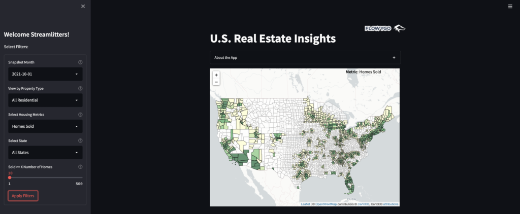
One small thing to note is that in line 20 of the code, .geojson.add_to(us_map) is used instead of .add_to(us_map). This is a little trick that allows you to hide the legend in the map. If .add_to(us_map) is used, the legend appears in the map but the scale numbers overlap, so I removed the legend from the map.
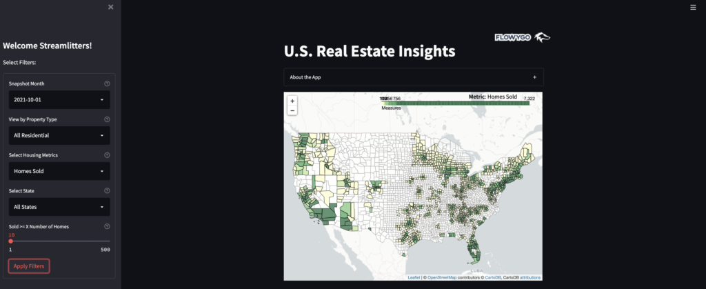
With these latest changes, the application is ready! Unlike the previous one, it is much more sophisticated and easy to use. And it can be an advanced starting point for building new apps.
All the code is available in the github repository. If you want to use the app you can connect to Streamlit Cloud.
